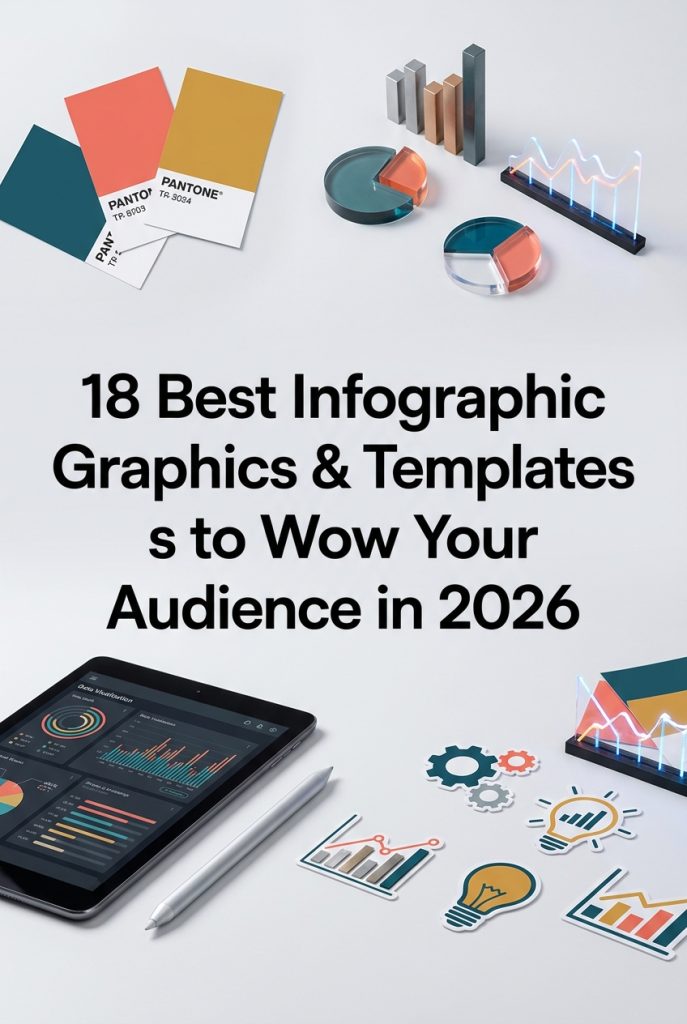
In the fast-paced digital landscape of 2026, data is king, but presentation is everything. Visual storytelling is no longer a niche skill—it’s essential for designers, marketers, and DIY crafters who need to communicate complex information quickly and effectively. This year’s trends favor bold, clear visuals that make data digestible and engaging. To help you stay ahead, we’ve curated a list of the 18 most popular and versatile infographic graphic kits on the market. These selections are perfect for transforming dense statistics into stunning visuals that capture attention and tell a compelling story.
Top Collection Picks (2026 Edition)
1. Chemical Reactions Infographics (by inkoly.art)
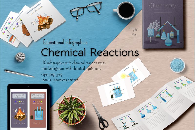
Chemical Reactions Infographics (by inkoly.art) delivers a fresh and vibrant approach to scientific illustration, transforming complex chemistry concepts into digestible, visually appealing graphics. This set ditches the dry, academic aesthetic for a clean, modern style filled with inviting colors and clear iconography. Each infographic is thoughtfully composed, making intricate processes like synthesis and decomposition not only understandable but genuinely engaging for students, educators, and science enthusiasts alike.
Features:
- A comprehensive set of 10 fully illustrated infographics covering main chemical reaction types.
- Includes versatile, text-free diagrams for complete customization and language adaptation.
- Supplied with a bonus chemistry background and a seamless pattern for cohesive branding.
- Available in high-quality EPS, JPG, and PNG formats for maximum flexibility across print and digital projects.
Best for:
- Crafting engaging educational posters, textbook illustrations, and classroom presentations.
- Enhancing science-focused websites, educational apps, and online learning modules.
- Designing clear and professional visuals for scientific research or corporate training.
- Creating compelling social media content for science communication channels.
2. 8 White Etsy Listing Infographics (by FolieDesign)
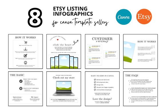
Effortless and impeccably clean, the 8 White Etsy Listing Infographics by FolieDesign offer a masterclass in minimalist design for digital creators. These Canva templates transform standard Etsy listings into polished, professional showcases, using a bright, airy aesthetic to build instant customer trust. By presenting key product details in a visually organized and stylish format, this collection ensures your digital goods—from planners to presets—look premium and are incredibly easy for buyers to understand, saving you precious design time while elevating your shop’s entire feel.
Features:
- Fully customizable Canva templates for easy drag-and-drop editing.
- Optimized 2000 x 2000 px square format for crisp, clear Etsy listings.
- Clean, minimalist aesthetic that directs focus to your product’s value.
- Includes bonus freebies to further enhance your digital shop’s assets.
Best for:
- Etsy sellers specializing in digital products like planners, templates, and printables.
- Creators looking to establish a cohesive and professional brand identity for their shop.
- Entrepreneurs who need to quickly create high-quality listing images without extensive design work.
- Designers wanting to clearly communicate the features and benefits of their digital downloads.
3. Mental Health PowerPoint Infographics (by pulsecolor)
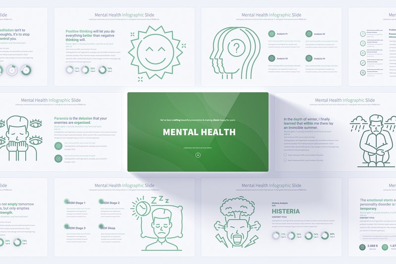
Mental Health PowerPoint Infographics (by pulsecolor) is a thoughtfully designed presentation toolkit that navigates sensitive topics with clarity and compassion. Its clean, modern aesthetic, characterized by soft color palettes and gentle, handmade illustrations, creates a safe and welcoming visual space. This template masterfully balances professionalism with a human touch, ensuring that complex information about mental well-being is presented in a way that is both digestible and deeply respectful, making it an essential asset for advocates and educators.
Features:
- A comprehensive set of 17 unique, fully animated slide layouts available in 12 distinct and calming color schemes.
- Effortless brand integration and global edits powered by a user-friendly Slide Master setup.
- Includes a bonus library of 280 fully editable vector icons, perfect for tailoring visuals to specific data points.
- Designed in crisp 16:9 Full HD resolution on a clean, light background for maximum readability and a professional finish.
Best for:
- Therapists, counselors, and psychologists presenting research or educational materials to peers and patients.
- Non-profits and advocacy groups developing impactful awareness campaigns and community outreach presentations.
- Corporate HR and wellness teams creating internal training on mental health in the workplace.
- Educators and healthcare professionals delivering clear, engaging lectures on psychological topics.
4. 8 Pink Etsy Listing Infographics (by FolieDesign)
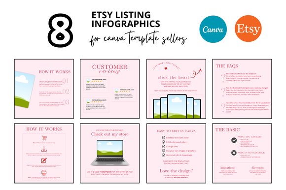
8 Pink Etsy Listing Infographics (by FolieDesign) embodies a chic, modern feminine aesthetic perfect for today’s digital creator. This collection of Canva templates provides a polished and cohesive way to present your Etsy listings, trading cluttered descriptions for clean, visually engaging infographics. The soft pink palette and minimalist layouts are expertly crafted to highlight key features, benefits, and bonus offers, instantly boosting your shop’s credibility and saving you invaluable design time. It’s a masterclass in turning product details into a beautiful, scannable, and professional presentation.
Features:
- Fully customizable Canva templates for easy drag-and-drop editing.
- High-resolution square format (2000 x 2000 px) optimized for Etsy listings.
- Includes a direct link for instant download and immediate access.
- Comes with bonus freebies to further enhance your shop’s branding.
Best for:
- Etsy sellers offering digital products like planners, templates, and printables.
- Shop owners aiming to create a cohesive and professional brand aesthetic across all listings.
- Creators who want to quickly generate high-quality listing images without extensive design skills.
- Showcasing product features, instructions, or bundle contents in a clear infographic format.
5. 10 Etsy Listing Photo Infographics (by FolieDesign)
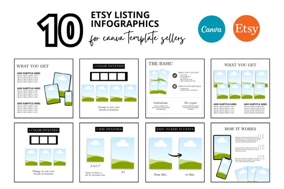
10 Etsy Listing Photo Infographics (by FolieDesign) is the antidote to cluttered, DIY-looking shop graphics that undersell your digital products. Say goodbye to inconsistent listing photos and hello to a flawlessly cohesive and professional storefront. These Canva templates are designed with a clean, minimalist aesthetic that puts your product’s value front and center, transforming your shop from a hobbyist’s corner into a polished, trustworthy brand. FolieDesign has crafted an essential toolkit that saves you precious time while ensuring every listing looks premium, communicates key information clearly, and ultimately, helps drive sales.
Features:
- Fully customizable Canva templates for easy drag-and-drop editing.
- Clean, professional, and minimalist aesthetic for a high-end look.
- Optimized 2000 x 2000 px square format perfect for Etsy listings.
- Includes bonus freebies to add extra value to your purchase.
Best for:
- Etsy sellers specializing in digital products like printables, planners, and templates.
- Shop owners seeking to create a cohesive and professional brand identity quickly.
- Entrepreneurs who want to save hours on creating high-quality listing images.
- Clearly presenting product features, instructions, and what’s included in a download.
6. Steps Business Infographics Template (by graphixtstock)
Steps Business Infographics Template (by graphixtstock) radiates a sense of clear, forward momentum. The design immediately communicates progress and structured growth through its clean, ascending steps and a vibrant, optimistic color palette. It’s a template that feels both professional and approachable, turning complex data into a visually satisfying journey from one stage to the next. The soft shadows and clean lines give it a polished, modern feel that makes any presentation feel instantly more dynamic and easy to follow.
Features:
- Clean, fully editable vector files in AI and EPS formats.
- A bright, contemporary color scheme that can be easily customized.
- Editable text fields with links to the free fonts used.
Best for:
- Visualizing project timelines and key development stages.
- Outlining business growth strategies or marketing funnels.
- Creating clear, step-by-step instructional guides or tutorials.
- Enhancing corporate presentations with clean, digestible data.
7. Process Flow Infographics PowerPoint (by pixslides)
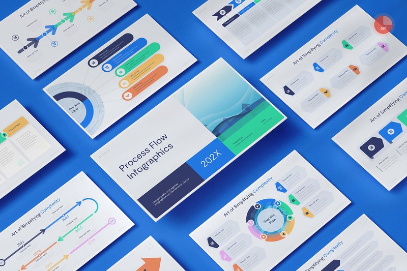
Process Flow Infographics PowerPoint (by pixslides) brings the fluid elegance of a master calligrapher’s hand to the often rigid world of data presentation. Each slide connects concepts with a graceful, intuitive logic, guiding the viewer’s eye from one point to the next with seamless transitions and a clean, modern aesthetic. This template doesn’t just show a process; it makes the journey feel coherent and visually satisfying, turning complex workflows into a clear, compelling narrative that is both professional and effortlessly stylish.
Features:
- 15 unique, professionally designed slides with a strong focus on typography and usability.
- Easy drag-and-drop image placeholders and fully editable charts based on master slides.
- A full suite of vector-based icons and a simple one-click color change system.
- Crisp, Full HD resolution ensures your presentation looks sharp on any screen.
Best for:
- Visualizing project timelines, operational workflows, and business processes with absolute clarity.
- Crafting compelling marketing funnels, customer journey maps, and sales pitch decks.
- Breaking down complex business strategies or organizational structures for corporate presentations.
- Developing clean, easy-to-follow training materials and educational guides.
8. Triangle Process Diagram Infographics (by DesignFour)
Triangle Process Diagram Infographics (by DesignFour) If you are looking for a way to illustrate cyclical processes, foundational concepts, or hierarchical structures with razor-sharp clarity, this collection delivers a clean, geometric aesthetic that feels both modern and timeless. These diagrams leverage the inherent stability and directionality of the triangle to guide the viewer’s eye through complex information, transforming mundane data into a dynamic and professional visual narrative.
Features:
- Fully editable 100% vector graphics for seamless scaling and customization.
- Includes a comprehensive file package (AI, EPS, SVG, PDF) for professional workflows.
- High-resolution transparent PNG file for quick and easy integration into any design.
Best for:
- Visualizing marketing funnels, business models, and strategic hierarchies.
- Mapping out project workflows, 3-step processes, and developmental stages.
- Breaking down complex theories or data sets for presentations and reports.
- Enhancing slide decks, websites, and print materials with polished, data-driven visuals.
9. Blue Rectangle Diagram Infographics (by DesignFour)
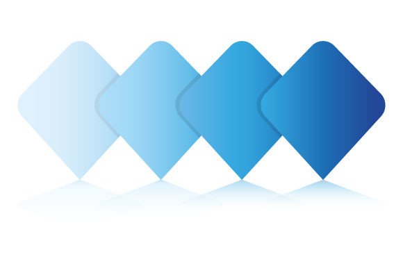
Blue Rectangle Diagram Infographics (by DesignFour) With its crisp, architectural lines and a cool, corporate-blue palette, this infographic set projects an immediate sense of structure and authority. The clean, geometric rectangles are perfect for organizing complex data into digestible, linear flows, creating a visual language that is both professional and effortlessly clear. It’s a foundational toolkit for any designer needing to communicate information with precision and a modern, polished aesthetic.
Features:
- 100% editable vector source files (AI, EPS, SVG) for complete customization.
- Includes a high-resolution, transparent PNG for quick and easy integration.
- A comprehensive package with AI, EPS, SVG, PDF, and PNG formats ensures maximum compatibility.
- Designed with a professional, cohesive blue color scheme.
Best for:
- Crafting clear and authoritative corporate presentations or annual reports.
- Mapping out business processes, project timelines, and organizational charts.
- Visualizing data for tech startups, financial services, and marketing analytics.
- Developing professional training materials and educational resources.
10. Blue Process Diagram Infographics (by DesignFour)
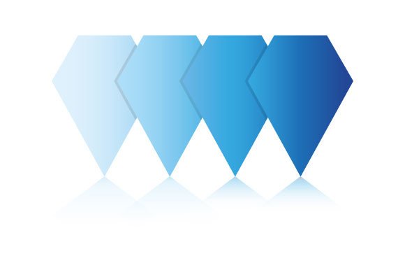
Blue Process Diagram Infographics (by DesignFour) will be an instant favorite for corporate trainers and business consultants tasked with simplifying complex workflows. This collection ditches overwhelming colors for a focused, calming blue palette that guides the eye and enhances comprehension. The design feels authoritative yet approachable, perfect for breaking down intricate processes, organizational charts, or project milestones in a way that feels both polished and easy to follow.
Features:
- Fully scalable and editable vector files (AI, EPS, SVG) for limitless customization.
- Includes a high-resolution PNG file with a transparent background for quick, easy use.
- Delivered as a neatly organized package with five distinct file types for maximum compatibility.
- A clean, monochromatic aesthetic that is easy to re-color to match any brand identity.
Best for:
- Visualizing project timelines and development roadmaps.
- Mapping out user flows and customer journey diagrams.
- Creating clear instructional materials for employee onboarding and training.
- Presenting business workflows and organizational structures in corporate reports.
11. Check Mark Process Diagram Infographics (by DesignFour)
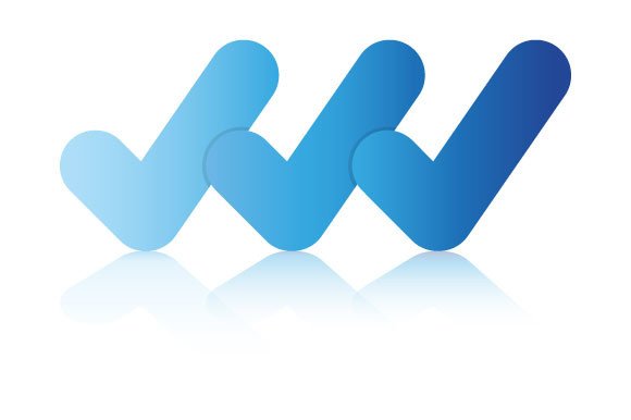
Check Mark Process Diagram Infographics (by DesignFour) is a masterclass in clarity and impact from a studio known for its clean, effective visual solutions. This collection masterfully transforms the universal symbol of completion into a powerful storytelling tool. The aesthetic is crisp, modern, and refreshingly positive, using a cohesive color palette and minimalist forms to guide the viewer’s eye through complex processes. Each diagram feels authoritative yet approachable, making it ideal for projects that need to communicate progress, successful workflows, and step-by-step achievements with an air of professional polish and undeniable confidence.
Features:
- Fully scalable 100% vector graphics (AI, EPS, SVG) for crystal-clear quality at any size.
- Effortlessly editable components, allowing for quick customization of colors, text, and layout to match your brand.
- Includes a high-resolution, transparent PNG file for immediate drag-and-drop use in presentations and web design.
- Comprehensive file package ensures compatibility across a wide range of design software and platforms.
Best for:
- Visualizing project milestones, timelines, and task completion stages in corporate presentations.
- Creating engaging onboarding guides and training materials that clearly outline procedural steps.
- Designing marketing assets that highlight quality assurance processes or customer success journeys.
- Building intuitive user interface (UI) elements for task management apps or software tutorials.
12. Timeline Infographics (by Salamahtype Template)
Timeline Infographics (by Salamahtype Template) Like a well-told love story, the best narratives unfold with grace and clarity, leading you from one moment to the next. This template provides that same romantic sense of progression for your data. It’s designed to guide the viewer’s eye along a clean, intuitive path, transforming complex chronologies into a compelling visual journey. With its professional yet warm aesthetic, this asset makes storytelling feel less like a lecture and more like an intimate conversation, perfect for building a connection with your audience.
Features:
- Includes fully editable 100% vector files in AI and EPS10 formats.
- High-resolution JPG file provided for quick previews and use.
- Clean, modern design with a professional color palette.
- Effortless to customize text, icons, and colors to match your brand.
Best for:
- Presenting company histories or key business milestones.
- Creating clear project roadmaps and development schedules.
- Visualizing historical events for educational or editorial content.
- Showcasing a step-by-step process for tutorials and onboarding materials.
13. Macro Trends in Technology Infographics (by IMG visuals icons)
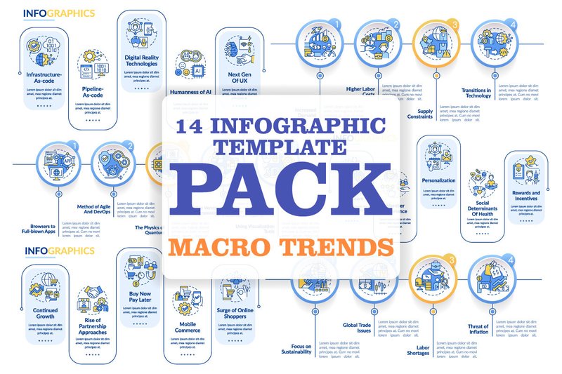
Macro Trends in Technology Infographics (by IMG visuals icons) exudes a sleek, corporate sophistication perfect for illustrating the digital landscape. This bundle delivers a crisp, digital-first aesthetic, translating complex data streams and technological processes into stunningly clear visual narratives. Its structured layouts, defined by clean line icons and a professional color palette, make it an indispensable tool for communicating forward-thinking concepts with authority and style.
Features:
- A versatile collection of templates focused on timelines, workflows, and processes.
- Crisp, minimalist line icons that enhance visual clarity.
- Professionally selected typography (Lato, Myriad Pro) for a polished look.
- Includes multiple high-compatibility file formats (AI, EPS, SVG, PNG, JPEG).
Best for:
- Tech companies creating annual reports or market analysis presentations.
- Digital agencies showcasing project roadmaps and workflow processes to clients.
- Consultants and analysts visualizing complex industry data and future trends.
- Startups pitching their technological solutions or development timelines to investors.
14. Speech Bubble Diagram Infographics (by DesignFour)
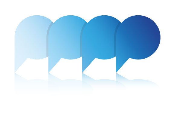
Speech Bubble Diagram Infographics (by DesignFour) Conversational and clean, this collection from DesignFour transforms data into a dynamic dialogue. The design uses the familiar, friendly shape of speech bubbles to present information in a way that feels personal and direct. It’s a brilliant solution for anyone looking to make their statistics, quotes, or process flows more relatable and less corporate. The soft color palette and minimalist vector lines ensure the focus remains on the message, making complex ideas feel simple and approachable for any audience.
Features:
- Fully editable 100% vector graphics for complete customization.
- Includes AI, EPS, SVG, and PDF files for professional design workflows.
- Comes with a high-resolution, transparent PNG for quick drag-and-drop use.
Best for:
- Visualizing customer testimonials and direct quotes.
- Creating engaging social media posts that highlight key stats or feedback.
- Simplifying communication flows or Q&A sections in presentations.
15. Map Pin Process Diagram Infographics (by DesignFour)
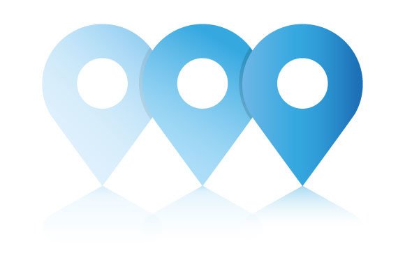
Map Pin Process Diagram Infographics (by DesignFour) is a sleek and intuitive template collection that transforms complex processes into a clear, directional narrative. It cleverly uses the familiar map pin icon to guide the eye through sequential steps, adding a touch of geographical flair to timelines, roadmaps, and workflows. The aesthetic is clean, modern, and highly professional, ensuring your data is not only easy to understand but also visually engaging, making it a perfect fit for contemporary corporate and educational projects.
Features:
- Fully editable vector source files (AI, EPS, SVG) for complete control over colors, sizing, and text.
- Includes a high-resolution transparent PNG for quick, drag-and-drop use in presentations and web design.
- A clean, minimalist design with a strong visual hierarchy that enhances readability.
- Versatile and adaptable for a wide range of process-oriented topics.
Best for:
- Visualizing project roadmaps and key development milestones.
- Mapping out customer journeys, sales funnels, or user onboarding flows.
- Creating step-by-step instructional guides or logistical process charts.
- Presenting company history timelines or future growth strategies.
16. Dialog Process Diagram Infographics (by DesignFour)
Dialog Process Diagram Infographics (by DesignFour) channels a crisp, modern corporate aesthetic to make complex communication flows visually coherent and engaging. This asset pack excels at turning abstract dialogues and multi-step processes into clean, easy-to-follow diagrams. With its soft color palette, clear vector lines, and logical structure, it brings a sense of professional polish and clarity to any project, ensuring your data-driven stories are both beautiful and instantly understandable.
Features:
- Fully editable 100% vector files (AI, EPS, SVG) for effortless resizing and customization.
- Comprehensive file package ensures compatibility across various design software.
- Includes a high-resolution, transparent PNG for quick drag-and-drop implementation.
Best for:
- Mapping customer support workflows and user journey dialogues.
- Visualizing business processes and internal communication chains.
- Creating compelling presentation slides that illustrate decision-making paths.
- Designing educational content that simplifies complex interactive systems.
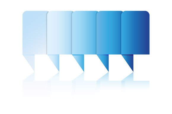
17. Rectangle Process Diagram Infographics (by DesignFour)
Rectangle Process Diagram Infographics (by DesignFour) is the antidote to confusing, chaotic flowcharts. Gone are the days of disjointed arrows and mismatched shapes that muddy your message. This collection introduces a sleek, linear clarity to your data, using a minimalist, grid-based aesthetic that feels both modern and effortlessly professional. Each diagram is a study in efficiency, guiding the viewer’s eye through complex processes with a clean, confident structure that makes information digestible and visually satisfying.
Features:
- 100% vector assets ensure crisp, scalable quality for any project size.
- Fully editable source files (AI, EPS, SVG) for complete creative control over colors, text, and layout.
- Includes a high-resolution, transparent PNG for quick drag-and-drop use.
- Comprehensive package with AI, EPS, SVG, PDF, and PNG files for maximum compatibility.
Best for:
- Creating clear, step-by-step visuals for business presentations and reports.
- Mapping out user flows, customer journeys, and internal workflows.
- Developing professional-grade educational materials and training guides.
- Visualizing marketing funnels and strategic project timelines.
18. Blue Drop Process Diagram Infographics (by DesignFour)

Blue Drop Process Diagram Infographics (by DesignFour) immediately instills a sense of calm clarity and fluid motion. This collection transforms complex workflows into a visually serene journey, using its clean, drop-like elements to guide the eye through stages with an organic and intuitive grace. It’s the perfect antidote to cluttered, rigid flowcharts, offering a fresh, modern aesthetic that feels both professional and approachable, making data feel less like a chore and more like a natural progression.
Features:
- Fully scalable and easily editable 100% vector files.
- Includes a high-resolution, transparent PNG file for immediate use.
- Comprehensive package with AI, EPS, SVG, PDF, and PNG formats.
Best for:
- Visualizing customer journeys or marketing funnels in business presentations.
- Breaking down project timelines and development stages for team reports.
- Creating clean, easy-to-follow user flow diagrams for web and app design.
- Simplifying complex concepts for educational materials or onboarding guides.
Principles of Effective Data Visualization
A beautiful infographic that confuses the reader has failed its primary mission. Before you even think about colors and fonts, remember that clarity is king. To ensure your data is the star of the show, keep these professional design principles in mind:
- Maximize the Data-to-Ink Ratio: A concept coined by data visualization pioneer Edward Tufte, this means dedicating most of your “ink” to displaying data, not to decorative fluff like unnecessary borders, backgrounds, or 3D effects. Ask yourself: does this element help clarify the data? If not, consider removing it.
- Create a Clear Visual Hierarchy: Guide your viewer’s eye through the information logically. Use size, color, and placement to signal importance. Your main title should be the most prominent, followed by section headers, and then body text and labels. A viewer should be able to grasp the main takeaways in seconds.
- Use Color with Purpose: Color isn’t just for decoration; it’s a powerful tool for grouping data, highlighting key points, and evoking emotion. Use a limited, cohesive color palette. Use one bright, high-contrast color as an accent to draw attention to the most critical statistics. Pro-tip: Always check your design in grayscale to ensure it’s still readable for colorblind viewers.
Vector vs. Raster: A Quick Technical Guide
When you download an infographic template, you’ll often get multiple file types. Choosing the right one is crucial for a professional result. The main difference is between vector and raster formats.
For infographics, vector formats (like AI, EPS, and SVG) are almost always the better choice. They are built with mathematical formulas, allowing you to scale them to any size—from a tiny web icon to a giant billboard—with zero loss of quality. Raster images (like JPG and PNG) are made of pixels and will become blurry or “pixelated” when enlarged.
| Characteristic | Vector (AI, EPS, SVG) | Raster (JPG, PNG) |
|---|---|---|
| Scalability | Infinite (no quality loss) | Limited (gets pixelated) |
| Editability | Easily edit individual shapes, lines, and text | Harder to edit individual elements |
| Best For | Logos, illustrations, charts, and infographics | Photographs and detailed digital paintings |
Beyond the Boardroom: Creative Infographic Ideas
Infographics aren’t just for quarterly reports and marketing analytics. Their power to simplify complex information makes them perfect for a wide range of personal and creative projects. Think outside the box and use these templates to:
- Craft a Visual Resume: Stand out from a pile of text-based CVs. Use an infographic to showcase your skills, experience timeline, and key achievements in a visually engaging way.
- Design an Event Itinerary: Planning a wedding, conference, or even a party? A timeline infographic is a fun and easy-to-read way to show guests what to expect and when.
- Summarize a Book or Movie: Create a visual summary of your favorite book, highlighting character relationships, plot points, and key themes. It’s a great way to share your passion on social media or a personal blog.
- Create a Personal “Year in Review”: Document your personal journey, travel, or fitness goals with a fun infographic. It makes for a fantastic and unique memento to share with family and friends.
👀 Didn’t find what you were looking for?
There are hundreds more cool options in the full collection for your project.
Conclusion
And there you have it—18 top-tier infographic kits to supercharge your design projects in 2026. With these powerful tools, you’re ready to tackle any data visualization challenge. Don’t just present data; make it memorable. Pick the template that fits your style and start creating impactful visuals today!