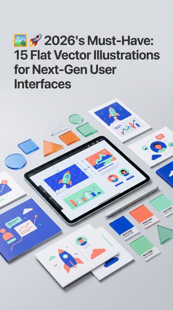
By 2026, user experience research indicates that interfaces will have less than 400 milliseconds to establish clarity and trust. This shrinking attention window is driving a powerful resurgence of flat design, not as a minimalist trend, but as a tool for immediate communication. It’s a critical shift from decorative visuals to high-impact, narrative-driven assets. We’ve hand-picked these 15 vector illustration sets specifically for their conceptual depth and effortless scalability in complex UI systems. This collection is engineered to accelerate your workflow, helping you build interfaces that are not just beautiful, but instantly understood by your users.
Top Collection Picks (2026 Edition)
1. Vector Graphic of Webinar (by Twiri)
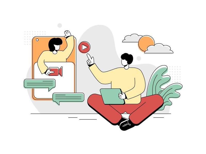
Vector Graphic of Webinar (by Twiri) If you are looking for an illustration that perfectly balances nostalgic charm with contemporary relevance, this asset is an exceptional find. Twiri delivers a clean, minimalist scene depicting a modern online discussion, but filters it through a distinctive retro color palette of muted greens, warm yellows, and sharp reds. The result is a graphic that feels both fresh and timeless, offering a friendly and approachable vibe that avoids the cold, corporate feel of many tech-themed illustrations. Its smart composition makes it an incredibly versatile piece for designers aiming to add a touch of personality to their digital interfaces.
Features:
- A striking retro-inspired color palette (green, red, yellow) for a unique, warm aesthetic.
- Clean, minimalist flat design style that ensures clarity and modern appeal.
- Depicts a relevant, contemporary concept of online collaboration and communication.
- Fully scalable vector format for high-resolution use across all devices and sizes.
Best for:
- UI/UX design for app onboarding screens, feature highlights, and empty states.
- Website hero images and landing page banners for tech startups or educational platforms.
- Marketing materials and social media posts promoting webinars or online courses.
- Enhancing blog posts or articles about remote work, digital communication, and e-learning.
2. Saving Money Flat Design Illustration (by Lartestudio)
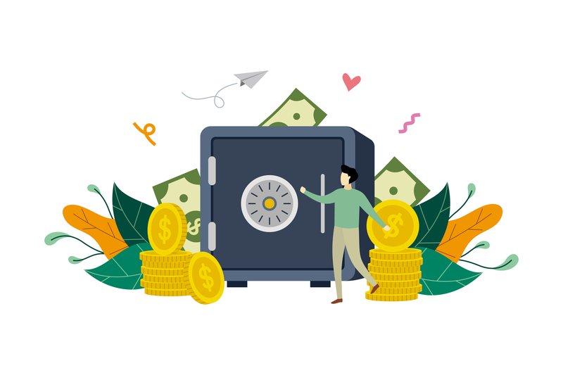
Saving Money Flat Design Illustration (by Lartestudio) is the antidote to stale, impersonal financial stock imagery. Gone are the days of cold, corporate visuals; this asset breathes life and personality into concepts of security and growth. It cleverly uses a charming micro-people concept, depicting them interacting with oversized symbols of wealth and safety. This narrative approach transforms abstract ideas like banking and deposits into a story that is relatable, optimistic, and visually engaging, making it a perfect fit for modern user interfaces that need to feel trustworthy and human.
Features:
- Clean, professional flat vector style with a soothing and modern color palette.
- Engaging “small people” concept that adds a human-centric narrative to financial topics.
- Features strong visual metaphors for security, including a safe box and deposit slots.
- Fully scalable vector source files, ensuring perfect clarity on any screen size.
Best for:
- Hero sections for banking websites and fintech landing pages.
- Onboarding flows and feature highlights within mobile finance apps.
- Spot illustrations for blog posts or articles explaining savings and investment.
- Digital ad campaigns that require a friendly and approachable visual hook.
3. Outdoor Camping Flat Design Illustration (by Lartestudio)

Outdoor Camping Flat Design Illustration (by Lartestudio) is a beautifully composed vector scene that brings the tranquility and camaraderie of the great outdoors directly to the screen. With its clean lines, harmonious color palette, and charming “small people” concept, this illustration creates an immediate sense of adventure and community. It’s a fresh and modern take on a timeless theme, expertly designed to add a friendly and organic touch to any digital project, making complex ideas feel approachable and engaging.
Features:
- Clean and contemporary flat design style with a focus on simple shapes and clear composition.
- Charming “small people” concept that adds a dynamic, human element to the scene.
- Fully scalable vector template, ensuring crisp, high-quality visuals on any screen size.
- A cohesive and warm color palette that evokes the feeling of a sunset in the wilderness.
Best for:
- Hero images, onboarding screens, and feature illustrations for travel or outdoor-themed apps.
- Website backgrounds, landing page banners, and blog post headers that need a narrative touch.
- Digital advertisements and social media graphics for eco-tourism or camping gear brands.
- Presentation slides and informational graphics requiring a friendly, approachable visual style.
4. DeliveryMan OnlineBusiness Assets Vector (by Fouziaabida)
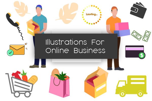
DeliveryMan OnlineBusiness Assets Vector (by Fouziaabida) Dynamic and incredibly clean, this collection of 16 flat illustrations is a designer’s toolkit for communicating speed, reliability, and modern service. Each scene, from logistics to online transactions, is rendered with a professional yet approachable aesthetic that feels instantly trustworthy. The illustrations are crafted to integrate seamlessly into contemporary user interfaces, providing clear visual storytelling that guides users and enhances the digital experience without adding clutter. It’s the perfect asset for projects that need to look polished, efficient, and ready for business.
Features:
- Fully editable and scalable 100% vector AI files.
- A clean, contemporary flat design style for a unified brand look.
- Well-organized and clearly named layers for an efficient workflow.
- A versatile collection of 16 illustrations covering delivery and online business themes.
Best for:
- Enhancing the UI/UX of logistics, e-commerce, and food delivery apps.
- Creating engaging onboarding flows and feature callouts for websites.
- Designing eye-catching social media posts and digital ad campaigns.
- Building high-converting landing pages and professional presentation slides.
5. Travel Flat Illustration (by pnajlab)
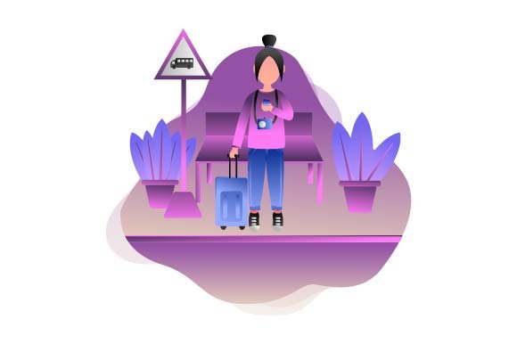
Travel Flat Illustration (by pnajlab) exudes a serene sense of modern adventure, translating the joy of discovery into a clean, minimalist visual. This illustration masterfully uses a warm, cohesive color palette and simple geometric forms to create a scene that is both inviting and incredibly versatile. It’s a perfect example of how flat design can communicate a rich narrative, making it an essential asset for projects aiming for a fresh, approachable, and stylish aesthetic.
Features:
- Clean and contemporary flat design style.
- Fully scalable and editable EPS vector source file for total creative control.
- Includes a high-resolution JPG for immediate, convenient use.
- A vibrant and welcoming color palette that enhances user engagement.
Best for:
- Creating compelling hero sections for travel websites and landing pages.
- Designing beautiful onboarding screens or empty states for mobile apps.
- Enhancing blog posts, social media graphics, and digital marketing campaigns.
- Adding a polished, thematic visual to UI/UX elements and backgrounds.
6. Wealth Richness Flat Design Illustration (by Lartestudio)
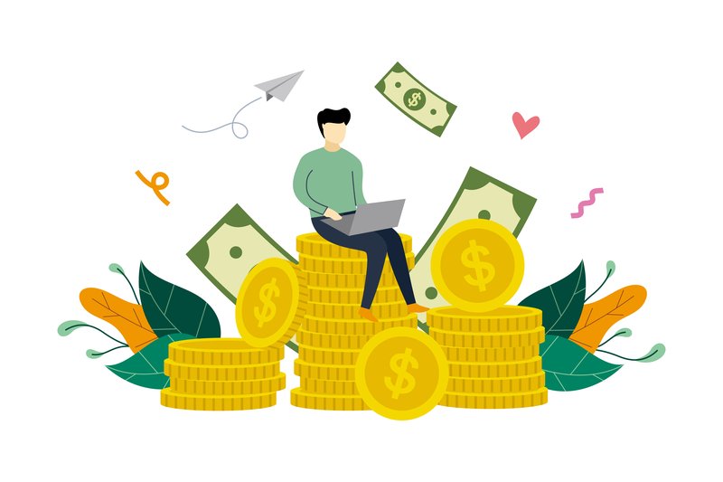
Wealth Richness Flat Design Illustration (by Lartestudio) is an immediate asset for fintech startups and financial advisors seeking to convey growth without intimidation. This illustration brilliantly translates the abstract concept of wealth into a tangible, optimistic visual: a confident businessman perched atop a stack of coins. It projects a narrative of success, smart investment, and attainable prosperity, all wrapped in a clean, friendly, and thoroughly modern design style that builds instant trust with users.
Features:
- A relatable character-driven concept that visualizes financial achievement.
- Clean, modern flat design aesthetic with a professional and approachable color scheme.
- Fully scalable vector format ensures crisp, high-quality display on any device or resolution.
- Thoughtfully composed with ample negative space, making it easy to overlay text or UI elements.
Best for:
- Hero sections on landing pages for investment apps, banking services, and financial consultancies.
- Onboarding screens or success-state modals within financial dashboards and mobile apps.
- Featured images for blog posts and articles on wealth management, savings, and profitability.
- Key visuals in digital ad campaigns or presentation slides focused on business growth.
7. Mobile Payment E-shop Flat Illustration (by Lartestudio)

Mobile Payment E-shop Flat Illustration (by Lartestudio) is crafted with the precision of modern calligraphy, where every line and curve serves a distinct, elegant purpose. Its composition feels intentional and fluid, guiding the eye through a seamless narrative of a digital transaction. The cool-toned palette and clean character design create a vibe that is both professional and approachable, transforming the often-impersonal subject of online payment into a refreshingly human-centric experience. This is not just a graphic; it’s a perfectly balanced statement on the simplicity and security of current e-commerce.
Features:
- Crisp, modern flat design with a professional and cohesive color scheme.
- A clear, focused narrative centered on mobile payments and online shopping.
- Fully scalable vector format ensures flawless quality on any screen size.
- Thoughtful composition that works perfectly as a hero image, background, or feature highlight.
Best for:
- Landing pages and hero sections for fintech apps, e-wallets, and online stores.
- UI/UX mockups to illustrate payment flows or transaction success screens.
- Onboarding tutorials for new users of an e-commerce platform.
- Digital ads and promotional banners for online payment services.
8. No Smoking Flat Design Illustration (by Lartestudio)
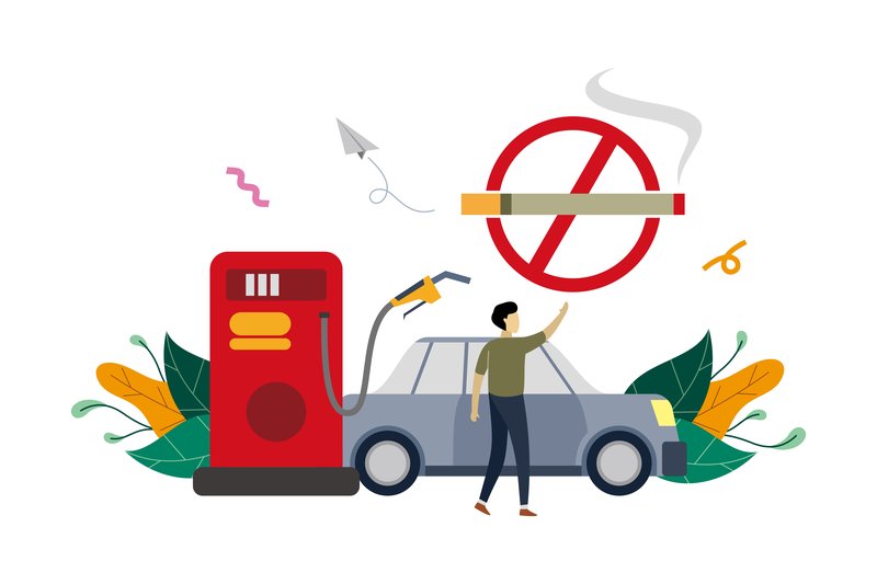
No Smoking Flat Design Illustration (by Lartestudio) With its clean, uniform strokes and a refreshingly cool color palette, this illustration transforms a standard warning into a piece of sleek, modern communication. Lartestudio masterfully balances a clear message with a friendly, approachable aesthetic, using a ‘small people’ concept to add a touch of narrative and scale. This isn’t just a sign; it’s a complete scene, ready to integrate seamlessly into UIs that prioritize clarity and a contemporary feel.
Features:
- Fully scalable vector format for crisp display on any screen.
- A professional, cohesive color scheme that’s easy to adapt.
- Engaging ‘tiny people’ scene concept that adds narrative depth.
- Well-organized layers for quick and effortless customization.
Best for:
- UI/UX design for app onboarding, instructional screens, or safety modals.
- Hero sections and background visuals for websites and landing pages.
- Digital signage and informational graphics in public or corporate settings.
- Blog post headers and social media banners requiring a clean, tech-forward look.
9. Online Shopping Flat Design Illustration (by Lartestudio)

Online Shopping Flat Design Illustration (by Lartestudio) is the creative spark that ignites a design project. Like a perfectly composed love letter, it communicates its message with clarity, charm, and a touch of modern romance. Lartestudio orchestrates a delightful scene where technology meets human connection, using a clean, flat aesthetic and a vibrant color palette to tell a story of seamless digital commerce. This illustration doesn’t just depict a transaction; it evokes the joy and ease of a perfect online find, making it an instantly relatable visual for any contemporary e-commerce platform.
Features:
- Clean, flat design style with a modern, friendly color palette.
- Engaging “small people” concept that adds a human element to a digital theme.
- Fully scalable vector format for flawless resizing.
- Thoughtfully composed for immediate use in UI/UX and advertising layouts.
Best for:
- Hero images and banners for e-commerce websites and landing pages.
- Onboarding screens and feature highlights in mobile shopping apps.
- Visuals for digital marketing campaigns and promotional emails.
- Enhancing presentations and case studies focused on UX/UI design for retail.
10. To Do List Business Planning Flat Style (by Delook Creative)
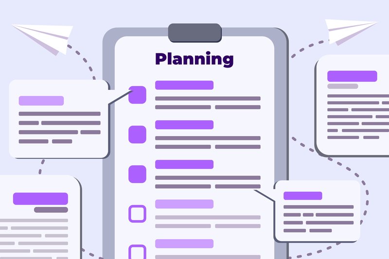
To Do List Business Planning Flat Style (by Delook Creative) is a masterclass in visual clarity and purpose-driven design. Delook Creative delivers a collection that expertly translates abstract concepts like project management and strategic planning into clean, digestible visuals. The illustrations feel both current and timeless, utilizing a friendly yet professional color palette and crisp linework that communicates efficiency and organization. This asset provides the visual shorthand needed to make modern user interfaces feel intuitive, orderly, and incredibly user-friendly, elevating any digital product focused on productivity.
Features:
- Crisp, minimalist flat design aesthetic.
- Fully scalable vector formats (SVG, EPS) for impeccable quality at any size.
- A versatile collection of 15 unique illustrations centered on business planning.
- Includes ready-to-use PNG and PDF files for immediate implementation.
Best for:
- Enhancing the UI/UX of productivity apps and SaaS platforms.
- Creating compelling infographics and website sections on time management.
- Designing clean onboarding visuals for project management software.
- Adding professional flair to presentations and motion graphics.
11. Vector Illustration Flat Design Car (by therintproject)

Vector Illustration Flat Design Car (by therintproject) channels a distinctly modern, minimalist aesthetic that feels both current and timeless. This illustration embodies the principles of clean flat design, using geometric precision and a harmonious color palette to create an image of forward motion and technological elegance. Its sleek lines and uncluttered composition make it a versatile asset, perfect for projects that need to communicate efficiency, innovation, or smart mobility without overwhelming the user.
Features:
- Sleek flat design aesthetic with clean lines and a professional look.
- Fully scalable vector format (EPS) for resizing without loss of quality.
- Multiple file formats included (EPS, PNG, JPG, PDF) for maximum compatibility.
- A balanced and contemporary color palette that is easy to customize.
Best for:
- UI/UX design for mobility, logistics, or automotive-themed applications.
- Hero illustrations for websites and landing pages in the tech sector.
- Digital banners and promotional graphics for car-sharing or delivery services.
- Spot illustrations within presentations and infographics about modern transportation.
12. ATM Cyber Crime Design Flat Illustration (by Lartestudio)

ATM Cyber Crime Design Flat Illustration (by Lartestudio) immediately pulls you into a world of sleek, digital-age tension. Lartestudio masterfully visualizes the abstract concept of cyber threats, turning a complex topic into a narrative that is both urgent and incredibly stylish. The cool, tech-focused color palette, punctuated by sharp alert tones, creates a vibe that feels perfectly suited for today’s digital landscape. It’s a design that doesn’t just show an action; it tells a story of vulnerability and detection with a clean, contemporary aesthetic that makes sophisticated concepts accessible and visually engaging.
Features:
- A complete narrative scene depicting ATM hacking, phishing alerts, and a cyber robber.
- Clean flat vector style featuring minimalist “small people” characters.
- A modern and purposeful color palette combining cool blues with urgent reds and yellows.
- Fully scalable and editable vector files, ensuring high-quality display on any screen.
Best for:
- UI/UX design for fintech or banking apps, especially for security features and alert screens.
- Hero images and banners for cybersecurity company websites and landing pages.
- Editorial illustrations for blog posts and articles discussing digital privacy and online fraud.
- Onboarding visuals for applications that need to educate users on security best practices.
13. Medical Checkup Flat Design Illustration (by Lartestudio)

Medical Checkup Flat Design Illustration (by Lartestudio) If you are looking for an illustration that makes the concept of healthcare feel modern, accessible, and reassuring, this asset from Lartestudio is an impeccable choice. It bypasses the cold, clinical feel often associated with medical visuals, opting instead for a clean, character-driven scene that communicates professionalism and care. The composition is perfectly balanced, guiding the eye through a narrative of examination and data analysis, making complex medical processes look simple and user-friendly.
Features:
- A clean and approachable aesthetic that uses a soft color palette and friendly character design to make medical themes feel welcoming.
- A well-balanced composition that provides ample negative space, making it easy to overlay text or UI components for banners and landing pages.
- Strong conceptual clarity, clearly depicting a narrative of a health checkup and data review that is ideal for explaining services.
- Fully scalable vector format ensures crisp, high-quality visuals on any screen size, from mobile apps to large displays.
Best for:
- Hero sections for health-tech websites and insurance provider landing pages.
- Onboarding screens and dashboards for patient portals or wellness apps.
- Promotional banners and digital ads for new healthcare programs or clinics.
- Supporting visuals for articles and reports on preventative care and medical technology.
14. Vector Graphic of Smart Ideas (by Twiri)
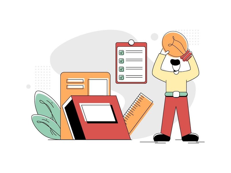
Vector Graphic of Smart Ideas (by Twiri) moves past the generic, soulless stock illustrations that often populate tech websites. This asset brings a distinct, thoughtful character to your project, blending a minimalist flat style with a warm, retro-inspired color palette. The clever composition—a figure illuminating knowledge with a lamp—serves as a powerful and immediate visual metaphor for insight, innovation, and learning. It’s a sophisticated and friendly illustration that feels both timeless and perfectly suited for modern digital interfaces.
Features:
- Minimalist Retro Aesthetic: Clean, flat shapes combined with a unique green, red, and yellow color scheme create a memorable and stylish vibe.
- Conceptual Storytelling: The illustration effectively communicates complex ideas like learning, discovery, and strategy in a simple, universal visual.
- Fully Scalable Vector: Edit and resize the graphic infinitely without any loss of quality, ensuring pixel-perfect results on any screen.
Best for:
- UI/UX Development: Perfect for onboarding flows, feature highlights, or empty states in web and mobile applications.
- Website Hero Sections: Create an engaging first impression for educational platforms, tech startups, or creative agencies.
- Digital Content: Elevate blog posts, presentations, and articles focused on topics like strategy, research, or brilliant ideas.
15. Computer Virus Flat Design Illustration (by Lartestudio)

Computer Virus Flat Design Illustration (by Lartestudio) is a brilliantly executed visual that translates the abstract concept of a digital threat into a tangible, engaging narrative. The composition uses a trending ‘small people’ concept, depicting a team actively combating a virus on a giant screen, which immediately adds a sense of urgency and human-centric action. Its clean lines, vibrant-yet-controlled color palette, and clear iconography make it a sophisticated and highly effective choice for modern digital interfaces focused on security, tech support, and data protection.
Features:
- Engaging ‘small people’ concept that visualizes teamwork and problem-solving.
- Crisp, flat vector style with a modern, professional color scheme.
- Clear visual hierarchy that draws attention to the central alert message.
- Fully scalable vector format for high-resolution displays and versatile use.
Best for:
- Hero sections for cybersecurity service websites and SaaS landing pages.
- Onboarding flows in antivirus software or security-focused applications.
- Illustrating articles and blog posts on topics like data breaches and online safety.
- UI/UX design for alert modals, error states, and system status dashboards.
The Swiss Roots of Clarity: Why Flat Design Endures
The flat vector aesthetic isn’t just a digital trend; its principles are rooted in the International Typographic Style, or Swiss Style, of the 1950s. This influential movement championed clarity, objectivity, and legibility above all else. By using grid-based layouts, sans-serif typography, and a rejection of ornamentation, designers like Josef Müller-Brockmann aimed for a universal, instantly understandable visual language. In today’s fast-paced digital world, these same principles are more relevant than ever, allowing your UI to cut through the noise and deliver its message with precision and speed.
Technical Deep Dive: Mastering the Lean SVG for Peak Performance
Vector illustrations are infinitely scalable, but their file size can impact your UI’s load time—a critical factor in that sub-400ms attention window. Before deploying an SVG, run it through an optimization process to ensure it’s as lean as possible. Your developers will thank you.
- Simplify Paths: In your vector editor (like Illustrator or Figma), use functions to simplify complex paths and remove unnecessary anchor points without visibly altering the illustration.
- Clean Up Your Layers: Delete any hidden or empty layers, and merge shapes where possible. A clean layer structure makes the SVG code much simpler.
- Remove Editor Metadata: SVGs exported from design tools often contain extra code, comments, and metadata. Use a tool like SVGOMG to safely strip this out, often reducing file size by 30-60%.
- Review Export Settings: When exporting, choose the minimal settings required. Deselect options like “style elements” if you are handling styles via CSS, and choose the lowest decimal precision that maintains visual quality (usually 1 or 2 is sufficient).
Pro Tip: Integrating Illustrations into Your Design System
To ensure consistency and scalability across a large product, don’t just “place” illustrations—integrate them into your design system. Treating them as a formal design token, just like colors or typography, creates a single source of truth and streamlines collaboration between designers and developers.
- Define Color Mapping: Create a system that allows your illustrations to adapt to your brand’s primary, secondary, or even dark-mode color palettes. This can be done by naming specific layers (e.g., “primary-fill,” “accent-stroke”) that developers can target with code.
- Establish Sizing Tiers: Just as you have H1/H2/H3 for text, define illustration sizes for different contexts. For example: Spot (small, for tooltips), Component (medium, for empty states), and Hero (large, for onboarding screens).
- Document Usage Guidelines: Specify rules for placement, accompanying text, and which types of illustrations are appropriate for different UI patterns (e.g., success, error, warning, or informational states).
Accessibility First: Ensuring Your Illustrations Communicate to Everyone
A beautiful interface is only successful if it’s usable by everyone. Illustrations, while visual, play a key role in accessibility. The first step is to determine if an illustration is decorative (purely for aesthetic appeal) or informative (conveying information). How you implement it in code depends entirely on this distinction.
| Informative Illustrations | These add context that isn’t already present in the text, such as an icon showing an error state. They must have a text alternative for screen reader users, typically via an <aria-label> or an associated text element. |
| Decorative Illustrations | These add visual flair but no new information. A background pattern or a generic hero image on a marketing page is a common example. These should be hidden from assistive technology using an empty alt attribute (alt="") or aria-hidden="true" to avoid cluttering the user experience. |
👀 Didn’t find what you were looking for?
There are hundreds more cool options in the full collection for your project.
Conclusion
Integrating one of these sets can turn a half-day of custom illustration into a ten-minute task, giving you back critical hours for solving core UX problems. Bookmark this page for your next design sprint or share it with your team to elevate your visual library. Ready for the next level? Soon we’ll be diving into how to choose the perfect icon system to complement these narrative illustrations, creating a truly cohesive user experience.