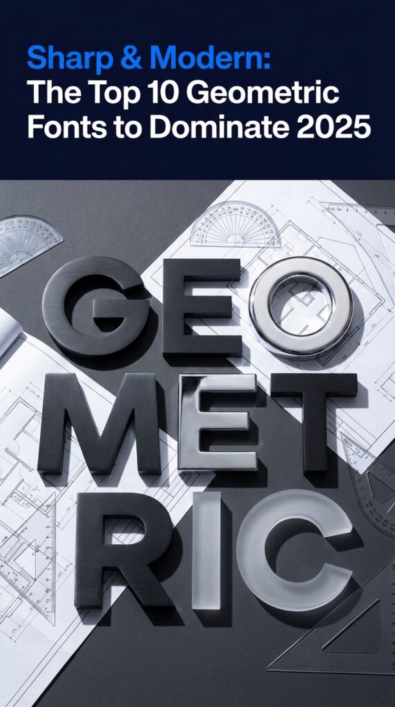
In the fast-paced world of digital design, the 2025-2026 trends are all about clarity, structure, and futuristic minimalism. This is where geometric fonts truly excel. Built on the clean precision of circles, squares, and triangles, these typefaces convey stability and a modern edge, making them perfect for tech branding, architectural projects, and sophisticated DIY crafts. They provide a strong foundation that feels both innovative and reliable. We’ve handpicked the 10 most popular geometric fonts that are making waves right now, ensuring your projects look sharp, current, and professional.
Top Collection Picks (2025-2026 Edition)
1. March Vibes

March Vibes combines the structural integrity of a classic geometric sans with a touch of contemporary warmth. Its clean, confident letterforms are meticulously crafted, offering exceptional legibility while maintaining a distinct, friendly personality that feels both professional and approachable.
As digital interfaces and brand identities push for greater clarity without sacrificing character, March Vibes emerges as a key player for upcoming projects. Its balanced aesthetic aligns perfectly with the 2025-2026 trend toward functional, human-centric design, making it a standout choice for brands aiming to feel modern yet accessible.
Features:
- A robust set of weights, from Light to Bold, providing versatile typographic hierarchy.
- Extended multilingual support covering a wide range of Latin-based languages.
- Precision-engineered kerning and spacing for optimal readability on-screen and in print.
- Includes stylistic alternates and ligatures for added creative flexibility.
Best for:
- Sophisticated UI/UX design for web and mobile applications where clarity is paramount.
- Minimalist branding and logo systems for tech startups and modern lifestyle brands.
- Crisp editorial layouts, digital publications, and corporate communications.
- High-end packaging and product labeling that requires a clean, premium feel.
2. Love June

Love June combines the rigid precision of a geometric sans-serif with an unexpectedly warm and friendly personality. Its clean lines and consistent stroke weight provide a strong, modern foundation, while subtle curves and open apertures lend it a delightful sense of approachability. This duality makes it a versatile and charismatic display font that commands attention without feeling cold or impersonal.
This font is a standout choice for forward-thinking branding as we head into 2025. It aligns perfectly with the growing design trend of humanizing digital spaces, where typography needs to be both structured and expressive. Love June’s ability to balance technical sharpness with a welcoming feel makes it an invaluable asset for creating memorable and emotionally resonant identities.
Features:
- Clean geometric construction with softened, rounded corners.
- Includes a full set of uppercase and lowercase characters.
- A robust collection of stylistic alternates and unique ligatures.
- Extensive multilingual support for global projects.
Best for:
- Modern logotypes and brand identity systems.
- High-impact headlines for websites and editorial layouts.
- Engaging social media graphics and marketing collateral.
- Sleek and contemporary packaging design.
3. Prime

Prime combines the stark precision of geometric construction with a subtle, humanistic touch. Created by moonbandit, this sans serif feels both engineered and approachable, boasting clean lines, balanced letterforms, and a confident, neutral tone that speaks with clarity and authority.
As the design world moves towards more structured, legible, and impactful typography, Prime’s architectural quality makes it a definitive choice for projects slated for 2025 and beyond. Its inherent modernity aligns perfectly with the increasing demand for typefaces that perform flawlessly across digital interfaces and print, ensuring brand messaging remains sharp and consistent in the years to come.
Features:
- A versatile family of weights, ranging from a delicate Thin to a powerful Black.
- Includes a full set of uppercase and lowercase characters, numerals, and punctuation.
- Optimized kerning for exceptional readability in both display and body text sizes.
- Extensive multilingual support for broad international application.
Best for:
- Technology branding and user interface design for web and mobile apps.
- Crisp, minimalist editorial layouts and magazine headlines.
- Corporate identity systems that require a modern and sophisticated voice.
- Architectural portfolios, wayfinding systems, and gallery signage.
4. Bauhaus

Bauhaus combines the foundational principles of early 20th-century modernism with a clean, contemporary edge. This geometric sans-serif, created by artyway, is built on a foundation of perfect circles, sharp angles, and unwavering consistency, resulting in a typeface that feels both historically significant and refreshingly current.
As digital interfaces and branding continue to favor structured clarity and authentic, minimalist forms, this typeface is perfectly positioned for the design landscape of 2025. Its rational geometry and highly legible construction make it a standout choice for projects aiming to communicate with precision and sophisticated simplicity, aligning perfectly with the push towards more intentional and functional aesthetics.
Features:
- Strictly geometric construction based on pure shapes for a clean, logical feel.
- A versatile family of weights, allowing for clear visual hierarchy in any design.
- Includes a full set of uppercase, lowercase, numerals, and essential punctuation.
- Excellent legibility on both screen and print applications.
Best for:
- Minimalist branding and forward-thinking logo designs.
- Impactful headlines and crisp digital user interface elements.
- Architectural presentations, tech startup identities, and gallery exhibition materials.
- Modern poster design and editorial layouts that require a strong, structural voice.
5. Akira Expanded

Akira Expanded combines the audacity of brutalist architecture with the clean precision of geometric sans-serifs. Its powerful, ultra-wide letterforms create an immediate sense of stability and impact, making a bold statement without any unnecessary frills.
This font’s unapologetic presence aligns perfectly with the shift towards maximalist and high-visibility typography we’re seeing for 2025. As brands fight for attention in digital spaces, Akira Expanded offers the clarity and commanding voice needed to cut through the noise, making it a key asset for forward-thinking design projects.
Features:
- All-caps character set for maximum impact
- Extremely wide, expanded letterforms
- Clean, geometric construction with sharp terminals
- Includes basic punctuation and numerals
Best for:
- Bold headlines for websites and editorials
- Modern logotypes and branding identities
- Event posters and promotional materials
- Striking social media graphics and quote cards
6. Environment

Environment combines the structural purity of a geometric sans serif with a refined, contemporary finish. Its balanced letterforms and clean lines create a sense of order and clarity, making it a versatile and sophisticated typographic tool.
This typeface is a standout choice for projects aiming to feel current through 2025 and 2026. As design trends continue to favor legibility and minimalist aesthetics, Environment’s sharp, uncluttered nature aligns perfectly with the demand for functional yet elegant branding and user interfaces.
Features:
- Clean, geometric construction with consistent stroke weights.
- A versatile family of weights for creating clear visual hierarchy.
- Excellent on-screen legibility, ideal for digital applications.
- Full multilingual support for broad project compatibility.
Best for:
- Modern corporate identities and branding systems.
- UI/UX design, including app interfaces and website body copy.
- Technical documentation, wayfinding, and architectural signage.
- Editorial layouts that require a clean, authoritative voice.
7. Elder Futhark

Elder Futhark combines ancient, runic mystique with the uncompromising precision of modern geometric design. Each character is a masterclass in balance, featuring sharp angles and clean lines that form a unique, almost cryptic visual language. This font from denestudios isn’t just a set of letters; it’s an atmospheric statement piece that feels both timeless and aggressively futuristic.
This fusion of historical depth and digital-era sharpness is precisely why it’s a formidable asset for projects heading into 2025. As brands increasingly seek to build narratives with substance and a unique edge, Elder Futhark provides a visual shortcut to a world of lore and innovation. It aligns perfectly with the design ethos of the coming years, where character and storytelling are reclaiming their place in a minimalist landscape.
Features:
- A complete set of sharp, geometrically constructed uppercase characters.
- Unique runic-inspired glyphs that offer a distinct typographic voice.
- Excellent legibility at display sizes, designed for maximum impact.
- Includes basic punctuation and numerals that match the font’s aesthetic.
Best for:
- Forward-thinking branding for tech, fashion, and gaming industries.
- High-impact headlines, movie titles, and event posters.
- Album covers and artist merchandise with a bold, modern-mystic vibe.
- Editorial design and packaging that demands a powerful, unforgettable identity.
8. Speed

Speed combines the precision of classic geometric sans-serifs with an undeniable sense of forward momentum. Its razor-sharp angles and clean, minimalist forms create a powerful visual rhythm, making it an assertive and highly contemporary display typeface.
This font’s unapologetic structure aligns perfectly with the push towards digital clarity and tech-focused aesthetics we’re seeing for 2025. As brands increasingly seek to communicate efficiency and innovation, Speed provides a visual language that is both immediate and sophisticated, making it a standout choice for modern branding initiatives in the coming years.
Features:
- Pure geometric construction with sharp terminals
- Full uppercase character set for impactful headlines
- Includes numerals and essential punctuation
- Optimized for high-impact display and digital screens
Best for:
- Logotypes and branding for tech, automotive, or sports industries
- Bold hero section headlines on websites and apps
- Modern poster design and editorial layouts
- UI elements that require a strong, legible typographic voice
9. Arcade

Arcade combines the nostalgic charm of 8-bit video games with the clean precision of modern geometric design. Developed by denestudios, this display font captures a unique energy, featuring sharp angles and a confident, blocky structure that feels both retro and remarkably fresh. Its bold presence is engineered to grab attention, making every headline feel like a high score.
This typeface is poised to define visual identities in the coming years as it masterfully taps into the growing “tech-nostalgia” trend. For projects aiming for a 2025-2026 aesthetic, Arcade provides a voice that is both familiar and forward-thinking, offering a sophisticated edge that elevates it beyond a simple novelty font. Its unique character aligns perfectly with brands wanting to communicate innovation with a touch of human-centric playfulness.
Features:
- Strong, geometric letterforms with sharp, clean angles.
- A high-impact display weight perfect for headlines and titles.
- Includes a full set of uppercase characters, numerals, and essential punctuation.
- Optimized for digital screens, ensuring crispness in UI and web applications.
Best for:
- Branding for tech startups, SaaS companies, and gaming studios.
- Eye-catching headlines on websites, posters, and event promotions.
- Logotypes and wordmarks that require a memorable, futuristic feel.
- Social media graphics and digital ad campaigns that need to stop the scroll.
10. Ornaments

Ornaments combines minimalist elegance with geometric precision, offering a curated collection of symbols and shapes that function as a versatile visual language. Far from a traditional typeface, this dingbats font by goodigital is a builder’s toolkit for crafting sharp, meaningful accents with effortless style.
This collection aligns perfectly with the push towards structured, clean aesthetics anticipated for 2025 and beyond. As designers seek to create unique brand expressions without visual clutter, Ornaments provides an articulate and sophisticated way to build custom icons and patterns that feel both timeless and decidedly forward-thinking.
Features:
- A comprehensive set of clean, geometric symbols and icons.
- Sharp, monolinear strokes perfect for minimalist designs.
- Delivered in a standard font format for easy use across all design software.
- Infinitely scalable vectors that maintain crispness at any size.
Best for:
- Developing unique brand patterns and background textures.
- Creating minimalist logos and abstract brand marks.
- Adding subtle, sophisticated accents to web and print layouts.
- Building custom, cohesive iconography for UI and digital products.
The Bauhaus Legacy: Where Geometry Meets Typography
Many of the geometric fonts we love today have their roots in the revolutionary Bauhaus school of design in the early 20th century. Driven by the philosophy of “form follows function,” designers like Herbert Bayer stripped away ornamentation to create typefaces built from pure, simple shapes like circles and lines. The iconic font Futura, designed in 1927, is a prime example of this movement. Understanding this history helps us appreciate why these fonts feel so timelessly modern, structured, and intentional.
Pro Tip: Creating Powerful Font Pairings
While geometric fonts make stunning headlines and logos, their rigid structure can sometimes feel fatiguing in long paragraphs of body text. To create a balanced and professional design, master the art of pairing:
- For Maximum Readability: Pair a bold geometric headline with a humanist sans-serif (like Lato or Cabin) or a classic serif (like Merriweather or Lora) for your body copy. This contrast creates a clear visual hierarchy and a comfortable reading experience.
- For a Softer, High-End Look: Combine your clean geometric font with an elegant, minimalist script font. This pairing is perfect for high-end fashion branding, wedding invitations, or social media quotes where you want a touch of humanity without losing the modern edge.
Mastering Space: The Secret to a Polished Look
Because geometric fonts are built on perfect shapes, the natural spacing between letters can sometimes look uneven to the human eye. Professionals obsess over this! To elevate your designs, pay close attention to:
- Tracking: This is the overall spacing between all letters in a word or sentence. For a clean, airy, and premium feel, try slightly increasing the tracking on your geometric headlines.
- Kerning: This is the manual adjustment of space between specific pairs of letters (like ‘A’ and ‘V’ or ‘T’ and ‘o’). Fixing these awkward gaps is a small detail that makes a massive difference, instantly making your work look more professional and intentional.
Beyond Geometry: Know Your Sans-Serifs
To make truly informed design choices, it helps to understand where geometric fonts fit within the broader sans-serif family. Each sub-category has a distinct personality and purpose.
| Category | Key Characteristic | Common Vibe |
|---|---|---|
| Geometric | Based on simple shapes (perfect circles, squares). | Modern, minimalist, stable, futuristic. |
| Humanist | Has calligraphic influence, more natural strokes. | Warm, friendly, open, highly readable. |
| Grotesque | Early sans-serifs, slightly clunky but solid. | Neutral, objective, straightforward, classic. |
👀 Didn’t find what you were looking for?
There are hundreds more cool options in the full collection for your project.
Conclusion
Whether you’re crafting a new brand identity or designing a cutting-edge website, the right geometric font is a powerful asset. These top 10 picks for 2025 offer the structure and style needed to make your work stand out. Experiment with these versatile typefaces to bring clarity and impact to your next creative endeavor.