In the competitive 2026 indie publishing scene, a captivating book cover is your most crucial marketing tool. Current trends favor bold typography, minimalist aesthetics, and authentic, textured designs that create an instant connection with readers. For designers and DIY authors, starting with a professional template is the smartest way to achieve a high-end look without the high-end budget. We’ve handpicked the two most popular and versatile book cover template bundles on the market right now. These collections are packed with on-trend designs, making it easier than ever to create a cover that sells.
Top Collection Picks (2026 Edition)
1. Cover Book Mockups Bundle (by Seinstudio)
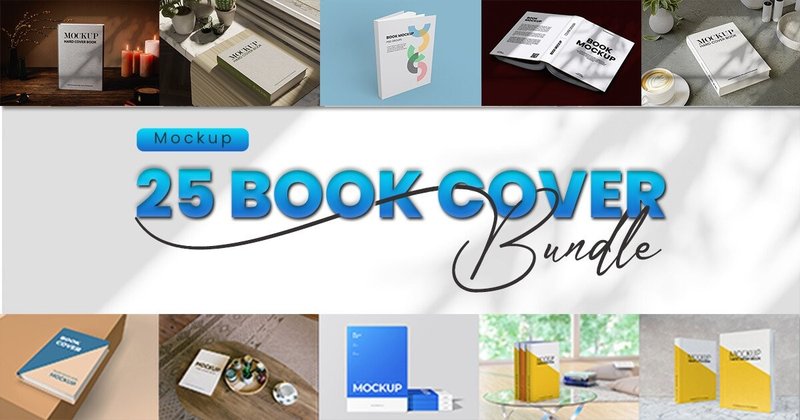
Cover Book Mockups Bundle (by Seinstudio) is a must-have for indie authors and graphic designers seeking a clean, professional aesthetic to showcase their literary creations. This bundle strips away the clutter, focusing on beautifully rendered, realistic book models that make a cover design feel tangible and premium. Its minimalist approach ensures the artwork itself remains the hero, presenting it in a polished context that’s perfect for portfolios, online stores, and social media announcements. For anyone needing to transform a flat cover design into a market-ready product shot with minimal fuss, this collection is an immediate and effective solution.
Features:
- Crisp, high-resolution files that ensure your cover details look sharp on any display.
- Effortless customization through well-organized PSD layers and smart object functionality.
- Transparent background options for ultimate flexibility in your marketing and web design.
Best for:
- Authors building a polished marketing kit for their book launch.
- Designers presenting cover art concepts to clients or in a professional portfolio.
- Creating clean, high-quality product images for Amazon, Shopify, or other online bookstores.
2. Covers & Interiors KDP Bundle Vol.1 (by Super KDP)
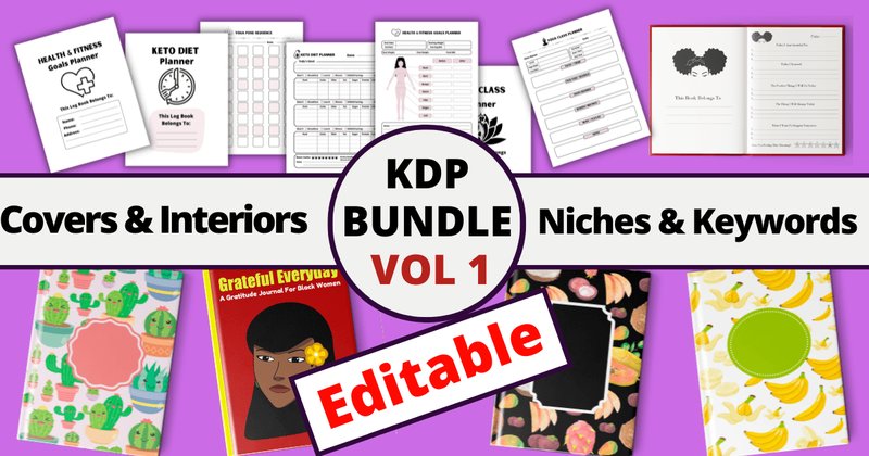
Covers & Interiors KDP Bundle Vol.1 (by Super KDP) embodies a playful, trend-focused aesthetic designed for maximum commercial appeal on the KDP marketplace. This bundle moves beyond simple templates, offering a comprehensive launch kit that blends charming, pattern-based cover designs with high-demand journal interiors. The vibe is cheerful and accessible, with assets like cute cactus patterns and gratitude-focused layouts that feel both current and evergreen. Its true strength lies in its practicality, providing not just the visual components but also the strategic keyword files needed to navigate popular niches, making it an incredibly efficient tool for creators aiming for quick market entry and discoverability.
Features:
- Includes a versatile mix of 11 interiors, 8 pattern-based covers, and 4 niche keyword files.
- Highly accessible editing options, with templates provided in PSD, PowerPoint, and Canva formats.
- Features complete journal sets (cover and interior) for niches like gratitude and daily blessings.
- All assets are sized at a standard 8.5″ x 11″ with no bleed for straightforward KDP uploading.
Best for:
- New KDP publishers seeking an all-in-one starter kit with designs and marketing data.
- Sellers targeting the evergreen gratitude journal and whimsical pattern notebook markets.
- Creators who want to rapidly scale their portfolio with easy-to-customize, commercially viable assets.
- Designers who value multi-format compatibility for editing across different software (Photoshop, PowerPoint, Canva).
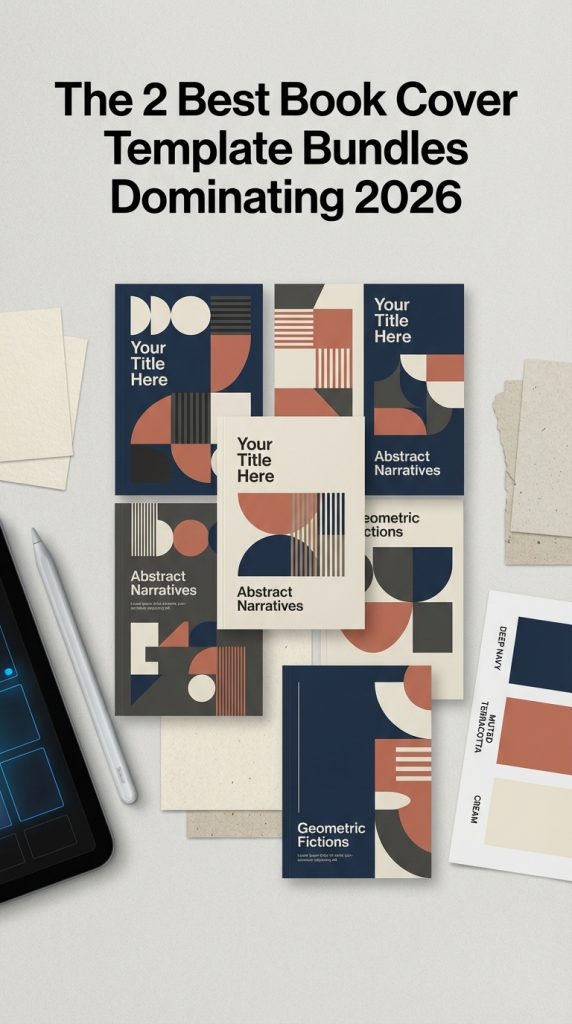
Pro Tip: Mastering Visual Hierarchy with Typography & Color
A great template is just the starting point. To make a cover truly yours, focus on visual hierarchy—guiding the reader’s eye to the most important information. Use these two levers:
- Typography Pairing: Don’t use more than two or three fonts. A classic rule is to pair a bold, attention-grabbing sans-serif font (like Helvetica or Futura) for your title with an elegant, readable serif font (like Garamond or Merriweather) for the author’s name and any subtitles. This contrast creates immediate clarity and a professional feel.
- Genre Color Psychology: Color sets the mood instantly. While your template provides a palette, feel free to adapt it to your genre. Deep blues and blacks signal mystery or sci-fi, vibrant reds and oranges suggest action or thrillers, soft pastels are perfect for romance, while earthy tones often suit literary fiction.
Technical Brief: The Crucial Difference Between CMYK and RGB
One of the most common mistakes for DIY authors is using the wrong color mode, which can lead to dull, disappointing printed books. Here’s what you need to know:
RGB (Red, Green, Blue) is an additive color model designed for digital screens. It uses light to create color, resulting in bright, vibrant hues. Use RGB for your e-book cover and all online promotional graphics.
CMYK (Cyan, Magenta, Yellow, Key/Black) is a subtractive color model used for printing. It uses ink on paper, and the color range (or “gamut”) is smaller than RGB. If you send an RGB file to a printer, the colors will be automatically converted and often look washed out.
The Golden Rule: Always work in or export a final CMYK version specifically for your print-on-demand or offset printing service. Your template bundle should include files in both formats or allow easy conversion. Check your printer’s specifications before you upload!
Usage Idea: Beyond the Cover – Build a Cohesive Author Brand
Your book cover template is more than a one-time asset; it’s the cornerstone of your entire author brand. Deconstruct the template to create a consistent visual identity across all your marketing channels. Repurpose the core elements:
- Social Media Graphics: Use the same fonts and color palette for your Instagram posts, Twitter headers, and Facebook banners.
- Bookmarks & Swag: Adapt the cover design into a vertical bookmark format or for merchandise like mugs and t-shirts.
- Author Website: Use the cover’s background textures and color scheme on your website to create a seamless experience for visitors.
This consistency makes your brand instantly recognizable and signals a high level of professionalism to potential readers and agents.
Design Deconstructed: Why Minimalism Resonates in 2026
The trend towards minimalist and bold typographic covers isn’t just an aesthetic choice; it’s a strategic one. Rooted in design principles from the Swiss Style (International Typographic Style) of the mid-20th century, minimalism prioritizes clarity, legibility, and objective presentation. In today’s crowded digital marketplace—an endless scroll of tiny thumbnails on Amazon or Goodreads—this approach is more powerful than ever. By stripping away visual noise, a minimalist cover uses negative space, a strong grid, and powerful typography to achieve two key goals:
- It forces the viewer’s attention directly onto the title and author name.
- It conveys confidence and sophistication, implying the story within is strong enough to speak for itself without needing a busy, illustrative scene.
👀 Didn’t find what you were looking for?
There are hundreds more cool options in the full collection for your project.
Conclusion
Ultimately, the right template empowers you to bring your vision to life with confidence and style. These two bundles offer exceptional value and quality, providing a professional starting point for any genre. Grab your favorite and start designing the bestseller-worthy cover your story deserves today!