In the fast-paced design world of 2026, efficiency is everything. Whether you’re a seasoned UX professional or a DIY crafter building your first app, starting with a solid foundation is crucial. That’s where UX and UI kits come in, providing pre-made components to accelerate your workflow and ensure a polished, consistent user experience. They are indispensable tools for rapid prototyping and bringing ideas to life quickly. We’ve sifted through the noise to bring you a definitive list of the 34 most popular and powerful UX/UI kits on the market today, each one ready to help you tackle modern design challenges.
Top Collection Picks (2026 Edition)
1. PopTrade – Trading Dashboard UI KIT (by dpopstudio)
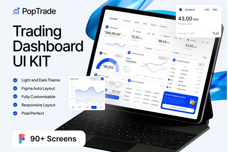
PopTrade – Trading Dashboard UI KIT (by dpopstudio) With its razor-thin strokes and surgically precise component alignment, PopTrade delivers a sophisticated, high-stakes vibe perfect for the world of finance. This isn’t just a collection of screens; it’s a complete, data-centric design system that prioritizes clarity and performance. The clean typography and balanced use of negative space ensure that complex charts, tickers, and order books are immediately scannable, giving users the confidence to make split-second decisions. It’s a professional, no-nonsense toolkit that feels both current and incredibly robust, designed to handle the density of information a modern trading platform demands.
Features:
- A massive library of 90+ screens, complete with both light and dark modes.
- Built on a well-organized Figma design system with responsive layouts.
- Fully customizable vector elements and free Google Fonts for easy brand integration.
- Includes a detailed guide for using the design system effectively.
Best for:
- Fintech startups building a new stock or cryptocurrency trading platform.
- Designers tasked with rapidly prototyping complex data visualization interfaces.
- Established financial firms aiming to modernize a legacy dashboard UI.
2. AI Koo – Ai Generator UI UX KIT (by dpopstudio)
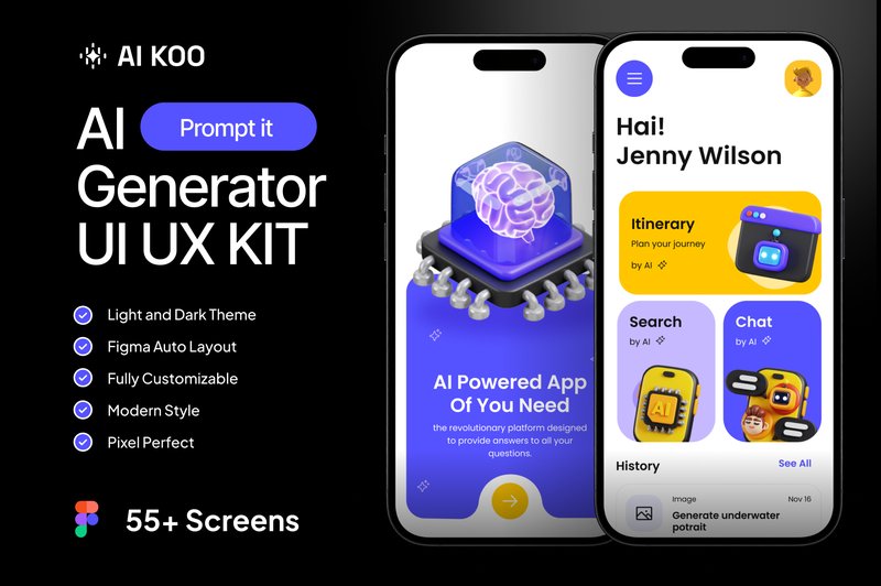
AI Koo – Ai Generator UI UX KIT (by dpopstudio) channels a distinctly futuristic and tech-forward aesthetic, making it the perfect foundation for any cutting-edge AI application. With its sharp typography, vibrant gradient accents, and meticulously structured layouts, this UI kit feels both intelligent and accessible. The design system is built around clarity and user interaction, providing a sleek, professional canvas that makes complex AI processes feel intuitive and engaging for the end-user. It’s a polished, forward-thinking toolkit for designers ready to build the next generation of generative AI tools.
Features:
- A comprehensive library of 55+ pre-designed screens.
- Beautifully crafted Dark and Light mode themes included.
- A complete design system with well-organized, fully customizable Figma components.
Best for:
- Designing AI-powered image or art generation mobile apps.
- Creating user interfaces for AI text generators, chatbots, or writing assistants.
- Prototyping futuristic tech applications with a focus on AI interaction.
3. Shopify Ecommerce Website Template (by shahtech50)
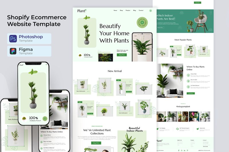
Shopify Ecommerce Website Template (by shahtech50) delivers a masterclass in clean, conversion-focused e-commerce design. This comprehensive UI kit, provided in both PSD and XD formats, acts as a powerful launchpad for designers building sophisticated Shopify storefronts. Rather than a rigid theme, it offers a flexible and meticulously organized design system, featuring polished layouts and a modern, grid-based structure that puts products front and center. It’s a toolkit built for clarity and sales, providing a timeless aesthetic that can be easily adapted to any brand, from high-end fashion to artisanal crafts.
Features:
- Comprehensive UI kit with source files for both Adobe Photoshop (PSD) and Adobe XD.
- Includes a full suite of specialized e-commerce page layouts, from homepages to product detail pages and checkout flows.
- Built on a clean, organized grid system with well-named layers for easy customization.
- A versatile and neutral aesthetic that is easily adaptable for diverse product categories.
Best for:
- Design agencies building custom Shopify themes for a range of clients.
- Freelance UX/UI designers creating high-fidelity prototypes for e-commerce projects.
- Startups needing a professional design foundation to guide their store’s development.
- Developers looking for a polished design blueprint to accelerate their workflow.
4. 7 Ecommerce Website Figma Templates (by shahtech50)
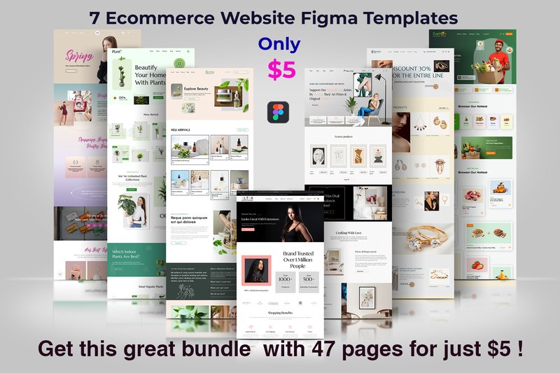
7 Ecommerce Website Figma Templates (by shahtech50) is a versatile and exceptionally structured toolkit designed to accelerate the creation of modern online stores. This collection moves beyond a single concept, offering a diverse array of seven distinct homepage layouts and a massive library of 40 inner pages, all built with a clean, professional aesthetic. The design feels both current and highly functional, prioritizing a clear user journey through well-organized layers and a minimalist approach to typography and iconography, making it an incredibly strong foundation for any WooCommerce project.
Features:
- A comprehensive collection of 7 unique homepage designs and over 40 essential inner page layouts.
- Meticulously organized Figma source files with separate, clearly named layers for easy editing.
- Fully customizable components, including colors, typography, and graphics, to match any brand identity.
- Includes free fonts and graphics, streamlining the asset collection process for designers.
Best for:
- Designers and developers launching polished WooCommerce stores on a tight deadline.
- Freelancers seeking a robust and adaptable starter kit for a wide range of client e-commerce projects.
- Startups needing a professional, conversion-focused digital storefront without a massive upfront design investment.
- Teams looking to rapidly prototype and validate multiple e-commerce concepts and user flows.
5. Taskboard – Task Dashboard UI UX KIT (by dpopstudio)
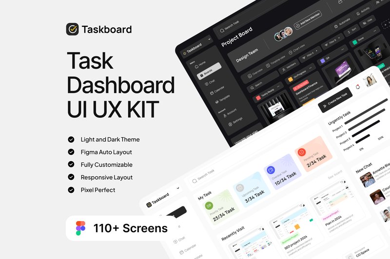
Taskboard – Task Dashboard UI UX KIT (by dpopstudio) If you are looking for a UI kit that exudes professional clarity and functional elegance, Taskboard is your definitive starting point. This meticulously crafted Figma kit is designed for building sophisticated, data-rich dashboards that prioritize user focus and productivity. With its clean typography, balanced spacing, and a stunning dual-mode interface (light and dark), Taskboard provides a timeless and intuitive foundation for any modern task management or analytics platform, ensuring your project looks polished and feels incredibly responsive right from the start.
Features:
- A comprehensive library of over 110 pre-designed screens, available in both light and dark themes.
- Impeccably organized Figma layers and a dedicated design system guide for streamlined customization and scaling.
- Fully responsive layouts optimized for a seamless experience across desktop and mobile devices.
- Built with free Google Fonts and 100% editable vector components for ultimate flexibility.
Best for:
- Designers building sophisticated project management applications or SaaS platforms.
- Startups needing a high-quality, scalable foundation for their team collaboration tools.
- Developers creating personal productivity apps, to-do lists, or habit trackers.
- Prototyping complex dashboards for client presentations and user testing.
6. Creatorcrowd – Software Startup Figma (by artgalaxy)
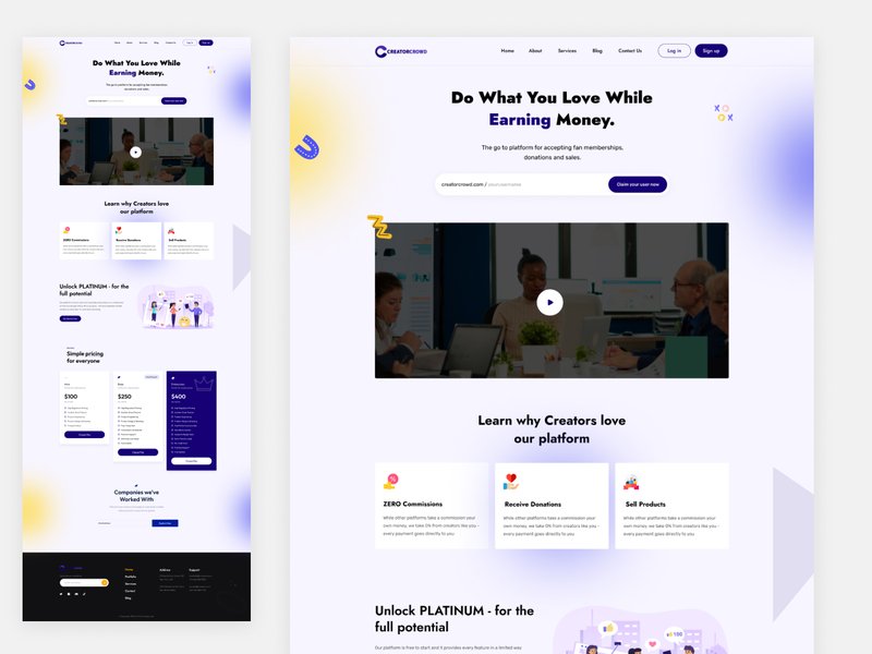
Creatorcrowd – Software Startup Figma (by artgalaxy) immediately projects a feeling of sharp, intelligent clarity through its typography and spacious layouts. This isn’t just a collection of screens; it’s a design system built on a foundation of clean lines, crisp sans-serif fonts, and a cool, approachable color palette that instills confidence and forward-thinking momentum. The vibe is pure, modern tech—uncluttered, user-centric, and ready to scale, giving designers a powerful launchpad for projects that need to feel both innovative and trustworthy from the very first click.
Features:
- A comprehensive suite of multi-niche layouts tailored for finance, e-learning, and project management apps.
- Built with a clean, component-based system that ensures consistency and scalability.
- Meticulously organized layers and global styles designed for rapid customization and workflow efficiency.
- Includes advanced theme options to provide deep creative control over the final look and feel.
Best for:
- Tech startups and SaaS companies aiming to build a polished, professional digital presence.
- Designers tasked with creating specialized software interfaces for help desks, live chats, or green tech solutions.
- Product teams needing a robust design foundation for rapidly prototyping and validating new app concepts.
- Agencies building modern, conversion-focused websites for software development clients.
7. Jobie Admin – Portal Dashboard UI Design (by peterdraw)
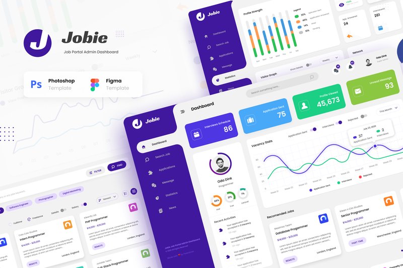
Jobie Admin – Portal Dashboard UI Design (by peterdraw) replaces the clunky, spreadsheet-inspired backends of the past with a clean, intuitive command center for the modern hiring manager. This UI kit ditches visual clutter for a sophisticated aesthetic defined by vibrant data visualizations, generous whitespace, and a calming, professional color palette. The result is an interface that feels less like a chore and more like a strategic tool, turning complex data from applications, companies, and candidate profiles into clear, actionable insights. It’s a masterclass in how a well-designed dashboard can empower users and elevate the entire recruitment process.
Features:
- Six meticulously crafted screens covering the complete hiring workflow, from dashboard overview to company statistics.
- Fully layered and organized files for both Figma and PSD, ensuring effortless customization.
- Built with free, accessible Google Fonts for a professional look without extra costs.
- A clean, modern design optimized for a 1920px widescreen view, perfect for desktop dashboards.
Best for:
- Designing the back-end interface for a modern job portal or career application.
- Creating a dedicated dashboard for HR professionals and hiring managers to track applicants.
- Building internal tools for managing freelancer platforms or corporate talent pools.
- Prototyping any data-rich admin panel that requires a clean, user-friendly, and statistics-focused layout.
8. Vora – Saas Admin Dashboard UI Design (by peterdraw)
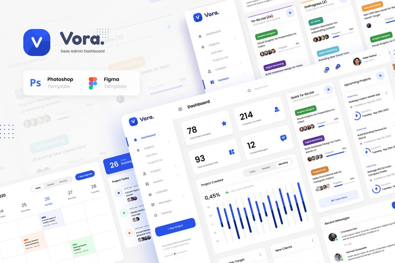
Vora – Saas Admin Dashboard UI Design (by peterdraw) is that rare creative spark that feels like love at first sight. It transforms the often-impersonal world of data and project management into a stunning visual experience, proving that functionality doesn’t have to be bland. With its clean lines, sophisticated color palette, and intuitive layout, Vora provides a fresh and engaging foundation that makes managing complex workflows feel less like a chore and more like a creative pursuit. This isn’t just an admin template; it’s a beautifully crafted canvas that brings clarity and style to your next SaaS application.
Features:
- A focused collection of 6 high-quality screens for essential SaaS functions.
- Fully editable files for both Figma and Adobe Photoshop, catering to your preferred workflow.
- Designed on a modern 1920px wide-screen format for a spacious and professional layout.
- Utilizes free Google Fonts and includes clear documentation for quick and easy customization.
Best for:
- Designers creating a sleek and modern interface for a new SaaS platform.
- Teams building internal tools for project management, team collaboration, or contact management.
- Developers who need a polished, ready-to-implement UI for an admin dashboard.
9. Stationary Store Landing Page (by peterdraw)
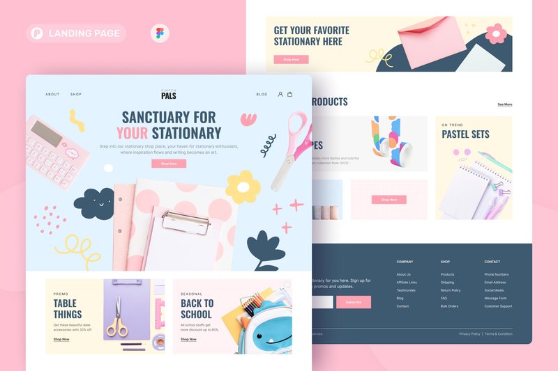
Stationary Store Landing Page (by peterdraw) is the digital equivalent of elegant, flowing calligraphy on pastel-colored paper. This Figma template immediately establishes a soft and cheerful atmosphere with its delightful candy-colored palette of baby pink, light blue, and warm yellow. The design feels both playful and polished, balancing a fun vibe with a clean, grid-aligned structure that makes navigation feel effortless. It’s an incredibly inviting layout that guides visitors through your products with the same ease and comfort as browsing a beautifully curated boutique, making it a perfect first impression for any creative brand.
Features:
- Playful, candy-colored UI with a clean, modern layout
- Fully editable Figma file built on a 1440px grid
- Uses a curated selection of free Google Fonts for easy setup
- Well-documented layers for quick and simple customization
Best for:
- Online boutiques selling stationery, art supplies, or creative goods
- Brands looking to create an approachable and cheerful online presence
- Quickly launching a beautiful landing page for a new product or collection
10. DreamDay – Wedding Planner Website (by peterdraw)
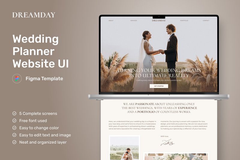
DreamDay – Wedding Planner Website (by peterdraw) is the perfect starting point for wedding planners and event organizers aiming to craft a sophisticated and inviting digital storefront. This clean, minimalist Figma template radiates a classy and elegant vibe, using a warm beige-brown color palette and delicate floral elements to create a dreamy, romantic atmosphere. It moves beyond a simple portfolio, offering a thoughtful user experience across five essential pages that guide potential clients seamlessly from a stunning homepage to detailed service packages. Its timeless design feels both current and enduring, making it an ideal choice for building a brand that clients will trust with their most important day.
Features:
- A complete five-page website structure (Homepage, About, Services, Packages).
- Elegant, minimalist aesthetic with a warm, beige-brown color palette.
- Utilizes free, accessible typography from Google Fonts for easy customization.
- Fully editable and re-sizable graphics to match your brand identity.
Best for:
- Wedding planners and event organizers building a professional online presence.
- Designers seeking a high-quality, elegant template for client projects in the bridal industry.
- Boutique bridal shops or floral studios looking to showcase their services and portfolio.
- Creating a polished and inviting landing page for any high-end event service.
11. Salon Apps (by ZwNstyle)
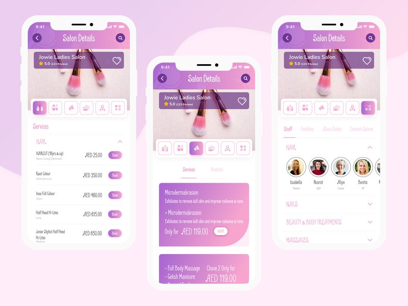
Salon Apps (by ZwNstyle) Delivers a fresh, trust-building interface for modern beauty and wellness platforms. This UI kit balances a clean, minimalist aesthetic with powerful, user-centric functionality, creating a calming digital space where finding and booking local specialists feels both effortless and secure. The soft color palette and thoughtfully organized layouts guide the user journey seamlessly, from initial search to final rating, establishing a vibe of professionalism and high-quality service.
Features:
- Robust discovery tools including interactive map views and sortable lists.
- Multi-faceted filtering system for services, pricing, and user ratings.
- Detailed specialist profiles with image galleries, service menus, and location info.
- Integrated user review and rating system to build community trust.
Best for:
- Building marketplace apps for freelance beauty professionals.
- Designing local service directories for salons, spas, and wellness clinics.
- Prototyping intuitive appointment booking and scheduling platforms.
- Creating a streamlined mobile experience for on-demand service apps.
12. WorkScape – Co-Working Space Website (by peterdraw)
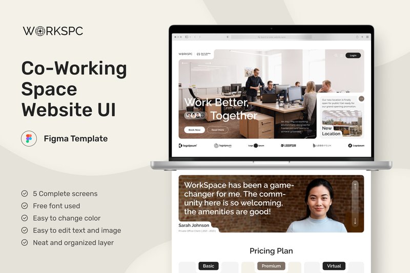
WorkScape – Co-Working Space Website (by peterdraw) is a meticulously crafted Figma UI kit that translates the collaborative and dynamic energy of modern co-working environments into a clean, intuitive digital experience. Its design philosophy centers around clarity and structure, utilizing a consistent card-based layout across five essential pages to present information in an engaging and easily digestible format. The result is a sophisticated and welcoming interface that feels both professional and approachable, perfectly suited for attracting and informing potential members about available spaces, events, and community culture.
Features:
- A complete 5-page structure covering all essential co-working touchpoints, from the homepage to event details.
- An intelligent card-based design system that creates visual rhythm and makes information scannable and engaging.
- A clean, modern aesthetic built on a 1440px grid with free Google Fonts for a polished and professional look.
- Fully editable and well-documented Figma file, allowing for easy customization to fit any brand identity.
Best for:
- Designers and agencies building websites for co-working spaces, shared offices, or business hubs.
- Startups and entrepreneurs needing to launch a polished, professional online presence quickly.
- Developers seeking a well-structured and visually appealing UI foundation for a custom build.
13. Multipurpose Admin Dashboard UI Design (by peterdraw)
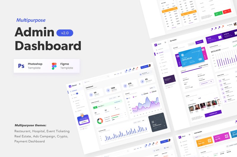
Multipurpose Admin Dashboard UI Design (by peterdraw) with its clean, confident lines and meticulously balanced components is a masterclass in functional elegance. It sidesteps flashy, distracting trends in favor of a clear, data-first aesthetic that feels both current and timeless. The design is built on a foundation of clarity, using thoughtful color palettes and crisp typography to make complex information digestible and visually engaging, ensuring your backend interface is as polished as your front-end.
Features:
- Over 66 meticulously crafted screens in both PSD and Figma formats.
- A rich collection of 11+ industry-specific themes, including hospitality, healthcare, and crypto.
- Fully customizable layouts built with free Google Fonts for seamless integration.
- High-resolution (1920px) design that is well-documented and easy to navigate.
Best for:
- Designers and developers needing a robust foundation for a custom SaaS platform.
- Creating specialized back-end interfaces for industries like real estate, event management, or finance.
- Rapidly prototyping and visualizing complex data dashboards for client presentations.
14. GoDoc – Health Care App Mobile UI KIT (by dpopstudio)
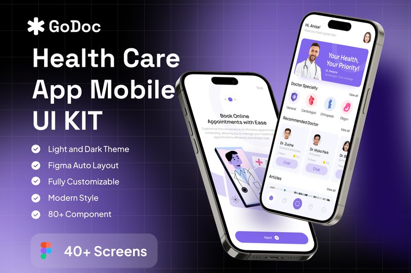
GoDoc – Health Care App Mobile UI KIT (by dpopstudio) channels a clean, trust-inspiring aesthetic that is essential for the digital health space. This Figma kit avoids clinical coldness, instead opting for a soft, approachable color palette and clear, user-centric layouts that prioritize accessibility and ease of navigation. The result is a design foundation that feels both professional and reassuring, empowering designers to build interfaces where users can confidently manage their health, book appointments, and connect with providers without friction.
Features:
- Over 40 meticulously designed screens covering core healthcare flows.
- Includes both Light and Dark Mode themes for superior user comfort.
- Comes with a Design System Guide for consistent and scalable development.
- Built with well-organized and fully customizable Figma layers.
Best for:
- Designing comprehensive telemedicine or virtual doctor consultation apps.
- Creating user-friendly patient portals for clinics and hospitals.
- Building modern wellness trackers or symptom-logging applications.
15. Workload – Project Management Admin UI (by peterdraw)
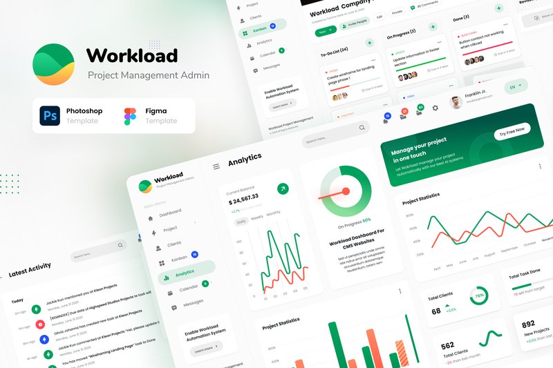
Workload – Project Management Admin UI (by peterdraw) delivers a masterclass in functional elegance, creating a user interface that feels both powerful and intuitively simple. This kit moves beyond mere templates, offering a thoughtful, data-centric design system that makes complex project analytics feel approachable and visually coherent. With its clean lines, sophisticated color palettes, and logical information hierarchy, Workload provides the perfect foundation for building a SaaS platform where clarity and efficiency are paramount, ensuring your dashboard looks polished and professional right out of the box.
Features:
- Includes 12 high-quality, unique screens provided in both PSD and Figma formats.
- Features beautifully crafted Dark and Light mode variants for all core pages.
- Fully customizable and easy to edit, utilizing free fonts from Google Font for accessibility.
- Comes with well-structured documentation to streamline the design process.
Best for:
- Designing sophisticated interfaces for SaaS and project management platforms.
- Building custom admin panels, client portals, and data-rich dashboards.
- Prototyping modern Kanban apps and team collaboration tools.
16. E-Wallet Mobile App UI Kit (by Broclan)
E-Wallet Mobile App UI Kit (by Broclan) Sophisticated and incredibly clean, this UI kit provides the polished, trustworthy aesthetic essential for any modern fintech application. Broclan delivers a masterclass in clarity, combining a minimalist color palette with intuitive layouts that make complex financial tasks feel effortless. It’s a complete, well-organized system designed to give startups and established agencies a significant head start in creating a secure and elegant user experience for e-wallets, payment apps, and digital banking platforms.
Features:
- A comprehensive collection of 40+ meticulously designed screens for all essential e-wallet functions.
- An atomic design system built in Figma, featuring over 70+ components for easy customization and brand consistency.
- Nine pre-mapped user flows that provide a clear blueprint for key interactions like onboarding, fund transfers, and bill payments.
- Impeccably organized layers and components, ensuring a smooth workflow and developer handoff.
Best for:
- Fintech startups aiming to rapidly prototype and launch a polished e-wallet or digital banking app.
- Design agencies seeking a high-quality, professional foundation for client projects in the financial sector.
- UI/UX designers who need to accelerate their workflow without compromising on a clean, trustworthy aesthetic.
17. HR Management Mobile App UI Kit (by betush)
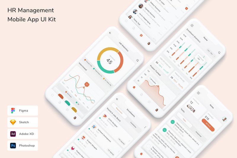
HR Management Mobile App UI Kit (by betush) If you are looking for a UI kit that transforms the often-clunky world of human resources into a sleek, intuitive mobile experience, this asset from betush is your answer. It delivers a fresh, professional aesthetic that feels both trustworthy and approachable, using a clean interface, soft color palettes, and clear data visualizations to simplify complex tasks like payroll, leave requests, and performance tracking. The design is impeccably organized, making it a joy to customize and build upon for any corporate or startup application.
Features:
- Comprehensive compatibility across Figma, Sketch, Adobe XD, and Photoshop.
- Meticulously organized layers with fully customizable fonts, colors, and vector shapes.
- A robust library of high-quality, pixel-perfect screens complemented by free fonts and icons.
Best for:
- Designers creating prototypes for corporate HR software pitches.
- Startups building a modern, employee-centric internal management application from scratch.
- Updating a legacy enterprise platform with a fresh, user-friendly mobile interface.
18. Nutrigo – Nutrition & Diet Dashboard (by peterdraw)
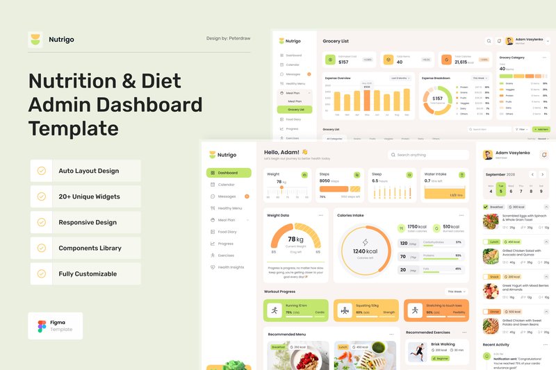
Nutrigo – Nutrition & Diet Dashboard (by peterdraw) radiates the zesty energy of a fresh-pressed juice, using a vibrant palette of citrus yellows, leafy greens, and warm oranges to instantly invigorate the user. This isn’t just a visual theme; it’s a deliberate design choice that makes the entire experience feel encouraging and full of life, perfectly aligning with the goals of a health-conscious audience. Peterdraw brilliantly organizes a wealth of information—from detailed meal plans and grocery lists to intricate progress charts—into clean, scannable layouts that make data feel digestible and motivating. The entire UI kit feels less like a sterile data tracker and more like a supportive partner, designed to boost a user’s spirit and make the journey toward a healthier lifestyle feel genuinely exciting.
Features:
- A comprehensive suite of 12+ pre-designed screens, including a dashboard, meal planner, grocery list, and progress tracker.
- Fully responsive and adaptive layouts for desktop (1440px), tablet (800px), and mobile (390px) views.
- An energetic and clean design system featuring vibrant charts and graphs to make data visualization engaging.
- Built for easy customization in Figma using a well-organized structure and free Google Fonts.
Best for:
- Health and wellness web applications focused on diet and nutrition tracking.
- Digital platforms for meal planning services or recipe discovery sites.
- UI/UX designers creating dashboards for fitness apps with integrated food diaries.
- Prototyping tools for nutritionists, dietitians, or personal wellness coaches.
19. Dpopfood – Food and Beverage Dashboard U (by dpopstudio)
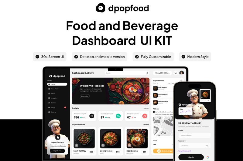
Dpopfood – Food and Beverage Dashboard U (by dpopstudio) banishes bland, spreadsheet-like dashboards in favor of a visually delicious and intuitive interface tailored for the culinary industry. This UI kit infuses data with personality, using a fresh, modern aesthetic, vibrant color accents, and clean typography to make analytics feel as approachable as a well-designed menu. It masterfully translates complex information into digestible charts and graphs, ensuring the user experience is both powerful and genuinely appetizing, perfect for any brand that wants its backend tools to reflect the quality of its products.
Features:
- A comprehensive collection of over 35 pre-designed screens for a complete dashboard experience.
- Fully responsive layouts thoughtfully adapted for desktop, tablet, and mobile devices.
- Impeccably organized and named layers in a native Figma file for effortless customization.
- A modern and clean design system built with 100% scalable vectors and easy-to-change global colors.
Best for:
- Restaurant chains needing a clear and engaging analytics platform.
- Food delivery services creating dashboards for their merchant partners.
- Startups building inventory and sales management apps for cafes or bars.
- Marketing teams tracking campaign performance for food and beverage brands.
20. Bilpay – Invoicing Admin Dashboard (by peterdraw)
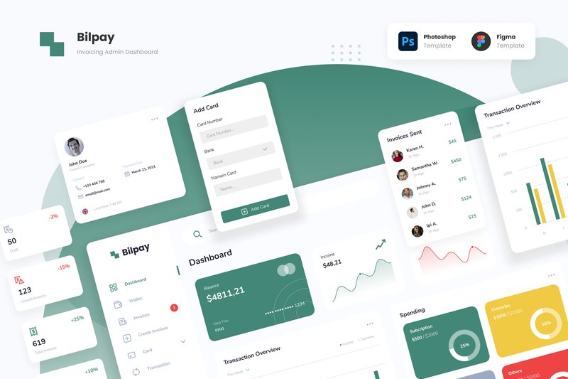
Bilpay – Invoicing Admin Dashboard (by peterdraw) is what happens when a design crush becomes a long-term relationship. It’s that rare UI kit that doesn’t just look good on the surface but brings a profound sense of clarity and calm to a notoriously chaotic space: financial management. Peterdraw transforms the mundane task of juggling multiple payment platforms into a visually delightful experience. The dashboard’s unique color palette—featuring unexpected but harmonious shades like deep forest green and banana yellow—creates a friendly, approachable atmosphere that makes managing transactions feel less like a chore and more like a creative pursuit. This isn’t just another template; it’s a thoughtful, modern solution for anyone looking to build a financial dashboard that users will genuinely enjoy using.
Features:
- 16 unique screen pages available in both light and dark modes
- Source files provided in both Figma and Adobe Photoshop (PSD) formats
- A distinctive and soft color palette featuring deep forest green, yellow banana, and smear violet
- Fully editable components, allowing for easy customization of text, colors, and imagery
Best for:
- Designers creating dashboards for e-wallets, digital payment apps, and crypto platforms
- Developing a centralized admin panel to manage multiple payment gateways
- Building intuitive user interfaces for invoicing or transaction history websites
- Anyone seeking a friendly, non-corporate aesthetic for a financial tool
21. Dompet – Payment Admin Dashboard UI (by peterdraw)
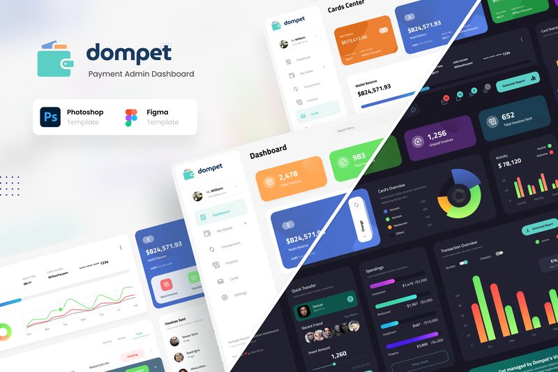
Dompet – Payment Admin Dashboard UI (by peterdraw) feels like the digital equivalent of perfect, modern calligraphy, where every element is placed with deliberate precision. It transforms complex financial data into an effortlessly legible narrative, with a clean, rhythmic layout that guides the eye through balances, transactions, and invoices. This isn’t just a functional interface; it’s a statement of clarity and control, rendered in a sleek, professional style that makes managing digital payments feel stunningly simple.
Features:
- Includes 12 unique, high-quality screens essential for financial management.
- Ships with both stunning Dark and clean Light modes for user preference.
- Fully editable and organized files for both Figma and Adobe Photoshop.
- Built on a 1920px wide canvas, ensuring a spacious and modern layout.
Best for:
- Building sophisticated admin panels for digital wallets and e-money platforms.
- Designing intuitive interfaces for invoice management and transaction histories.
- Creating a central hub for users to manage cards and payment details.
- Any fintech application requiring a polished, data-rich user dashboard.
22. Finance Tracking Mobile App UI Kit (by 3djagan)
![]()
Finance Tracking Mobile App UI Kit (by 3djagan) is the perfect starting point for fintech startups aiming to make personal finance feel less intimidating and more engaging for a modern user base. This kit ditches the stuffy, corporate feel of traditional banking apps in favor of a vibrant, data-rich aesthetic that’s both beautiful and highly functional. With its clean typography, colorful charts, and intuitive layouts available in both light and dark modes, it provides a solid, professional foundation that makes complex financial data easily digestible and even enjoyable to interact with.
Features:
- 48 meticulously designed screens in both light and dark themes.
- Broad compatibility with Figma, Sketch, Adobe XD, and Photoshop.
- Built with symbol objects and well-organized, grouped layers for rapid customization.
- A fresh, colorful design system that makes data visualization clear and appealing.
Best for:
- Designers building feature-rich personal budgeting or expense tracking applications.
- Startups needing to quickly prototype and validate a fintech MVP.
- Creating a clean interface for investment portfolio or subscription management tools.
- Freelancers seeking a high-quality, adaptable foundation for client finance projects.
23. Task & Project Management Dashboard (by peterdraw)
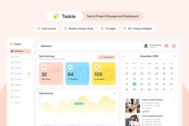
Task & Project Management Dashboard (by peterdraw) delivers a breath of fresh air to the world of productivity tools, radiating a calm yet focused energy through its soft and bright color scheme. This Figma template masterfully balances a modern, clean aesthetic with user-centric design, ensuring that managing complex projects feels less like a chore and more like an intuitive, visually pleasing experience. Its well-organized layout and attractive data visualizations create an environment where clarity and efficiency thrive, making it a perfect starting point for any team that values design-driven functionality.
Features:
- A serene and motivating color palette that keeps users engaged without causing visual fatigue.
- 13 meticulously designed screens covering all core aspects of task and project management workflows.
- A suite of attractive, editable charts and graphs for clear and compelling data visualization.
- A clean, well-documented, and highly organized layout built for easy customization in Figma.
Best for:
- Design teams building a custom in-house project management tool with a focus on a positive user experience.
- Startups and agencies looking for a polished, modern foundation for their SaaS product dashboard.
- UI/UX designers needing a high-quality template to quickly prototype and present task management concepts.
- Product managers aiming to visualize a user-friendly interface that prioritizes clarity and aesthetic appeal.
24. Community Managment Web App Ui Kit (by xflow)
Community Managment Web App Ui Kit (by xflow) is a sophisticated and highly organized toolkit for crafting data-centric management dashboards. Its aesthetic is clean, modern, and professional, utilizing a spacious layout and crisp data visualizations to make complex information feel intuitive and accessible. With a sleek dark mode and fully responsive mobile views included, this kit provides a polished, enterprise-level foundation for any application focused on analytics and user engagement.
Features:
- A comprehensive library of 100+ component charts designed for clear data visualization.
- Thoughtfully designed dark mode and mobile-sized versions included for a seamless user experience across all devices.
- Effortless customization through global color and text styles, allowing for quick brand alignment.
Best for:
- Crafting detailed dashboards for social media management or community moderation tools.
- Building the administrative interface for SaaS platforms, online forums, or membership sites.
- Prototyping data-heavy analytics platforms that track user engagement and activity.
25. Fillow – Saas Admin Dashboard UI (by peterdraw)
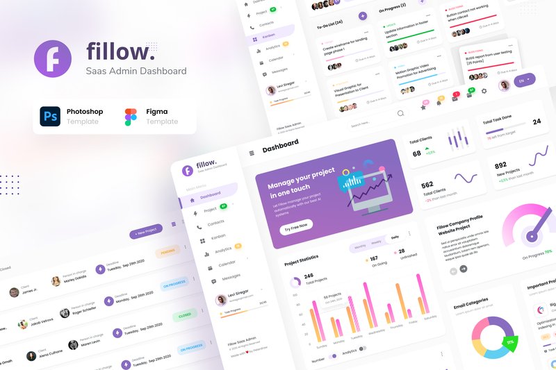
Fillow – Saas Admin Dashboard UI (by peterdraw) With its crisp, geometric lines and a meticulously balanced layout, Fillow presents a dashboard experience that feels both powerful and effortlessly clean. The design’s understated color palette and sharp typography create an atmosphere of calm focus, allowing complex data and project workflows to be digested with absolute clarity. It’s a template that doesn’t shout for attention but earns it through a sophisticated, professional, and user-centric structure perfect for any data-driven application.
Features:
- A comprehensive set of 12 unique, high-quality screens for core dashboard functions.
- Beautifully crafted dark and light mode themes to suit user preferences and brand aesthetics.
- Fully editable and well-organized source files for both Figma and Adobe Photoshop.
- Built on a 1920px widescreen grid and uses free, accessible Google Fonts for easy implementation.
Best for:
- Building a sophisticated admin panel for a modern SaaS platform.
- Designing a powerful and intuitive project management or CRM tool from the ground up.
- Creating a visually engaging interface for a Kanban-style workflow application.
- Rapidly prototyping high-fidelity dashboards for user testing and client presentations.
26. DeliverEase – Food Delivery Dashboard V2 (by twinletter)
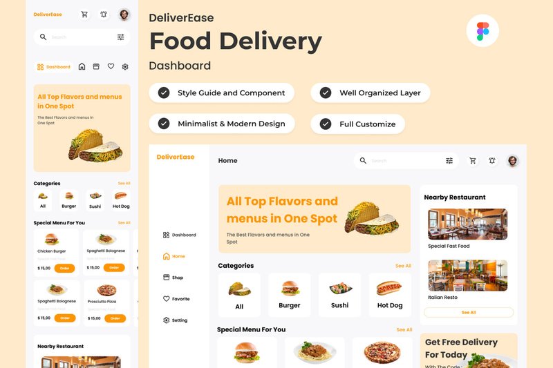
DeliverEase – Food Delivery Dashboard V2 (by twinletter) embodies a sleek, modern aesthetic that feels perfectly aligned with current tech trends. This UI kit is all about clarity and efficiency, presenting complex delivery logistics through a clean, data-centric interface. Its minimalist approach, combined with a sharp, professional color palette, gives off a vibe of sophisticated control, making it ideal for services that want to project reliability and cutting-edge functionality. The design prioritizes scannability and intuitive navigation, ensuring that managing real-time orders and customer feedback is a seamless, friction-free experience for operators.
Features:
- Fully responsive layouts for both desktop and mobile dashboards.
- Built with global text and color styles for effortless brand customization.
- Impeccably organized layers and components within a native Figma (.fig) file.
Best for:
- Startups building a new food delivery platform or restaurant management system.
- Designers tasked with redesigning an existing logistics or delivery service dashboard.
- Product teams needing a high-fidelity prototype to visualize complex operational workflows.
27. Quad SASS Software and AI Design Figma (by fleexstudio)
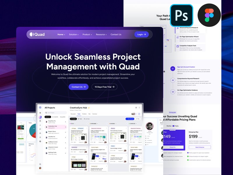
Quad SASS Software and AI Design Figma (by fleexstudio) is a testament to fleexstudio’s mastery of clean, tech-forward aesthetics. This landing page template masterfully blends a futuristic vibe with the crisp professionalism required for modern service-based businesses. Its design feels both intelligent and approachable, utilizing a sophisticated color palette, sharp typography, and custom vector illustrations to create an immediate sense of authority and innovation. It’s the perfect digital handshake for companies operating at the intersection of technology and consulting, promising a seamless user experience that builds trust from the very first scroll.
Features:
- A comprehensive, single-artboard landing page design for a focused user journey.
- Built with Figma styles and components for rapid, 100% customization.
- Organized on a developer-friendly 1170px Bootstrap grid system.
- Includes a suite of unique, fully-scalable vector illustrations and icons.
Best for:
- SaaS platforms and AI startups launching a new product.
- Technology consultants, financial advisors, and modern law firms.
- Digital agencies crafting polished websites for corporate clients.
- Life coaches and wellness professionals seeking a fresh, modern online presence.
28. Cryptix – Daily Trader Crypto Wallet App (by Productype)
Cryptix – Daily Trader Crypto Wallet App (by Productype) is an authoritative and focused UI kit that brings a sense of calm and control to the volatile world of crypto trading. Its design philosophy centers on functional minimalism, leveraging the sharp legibility of IBM Plex Mono to make data-heavy screens feel precise and manageable. The entire experience is built for trust, with a disciplined color palette that reduces visual fatigue during long trading sessions and a grid-based iconography system that ensures every action is clear and intentional. For teams aiming to build a fintech product that feels both modern and incredibly secure, Cryptix provides the perfect, high-performance foundation.
Features:
- Clean, data-centric layouts using the IBM Plex Mono typeface for ultimate clarity.
- A sophisticated, low-fatigue color palette designed for high-stakes environments.
- A complete system of grid-based icons for consistent and intuitive navigation.
- Fully customizable components with well-organized layers for rapid prototyping.
Best for:
- Fintech teams developing secure, user-centric crypto wallets or exchanges.
- Building interfaces for high-frequency trading and asset management platforms.
- Startups aiming to establish a brand identity centered on trust and precision.
- Designing scalable blockchain-based financial products with a premium feel.
29. Flavors – Food Menu Dashboard V2 (by twinletter)
Flavors – Food Menu Dashboard V2 (by twinletter) If you are looking for a UI kit that transforms the often-mundane task of menu management into a visually rich and intuitive experience, Flavors V2 is your answer. This dashboard design exudes a sleek, professional vibe, using a clean layout, sophisticated typography, and ample white space to make menu items and analytics pop. It feels less like a backend tool and more like an extension of a high-end restaurant’s brand, empowering chefs and managers to curate their culinary offerings with the same passion they put into their food. The design is both aesthetically pleasing and highly functional, promising a seamless workflow for anyone managing a modern dining establishment.
Features:
- A clean, modern interface with responsive layouts for both desktop and mobile views.
- Global text and color styles that make it incredibly easy to apply brand identity and maintain consistency.
- Meticulously organized layers and components, designed for quick adjustments and a streamlined design process.
- Full compatibility across major design tools, including Figma, Sketch, and Adobe XD.
Best for:
- Designers creating bespoke management systems for restaurants, cafes, or bars.
- Developers needing a polished, professional front-end for a food service application.
- Restaurant owners and managers looking to prototype a custom in-house menu dashboard.
- Food-tech startups building out their product’s user interface with a focus on premium aesthetics.
30. Hia – HR Management App UI KIT (by dpopstudio)
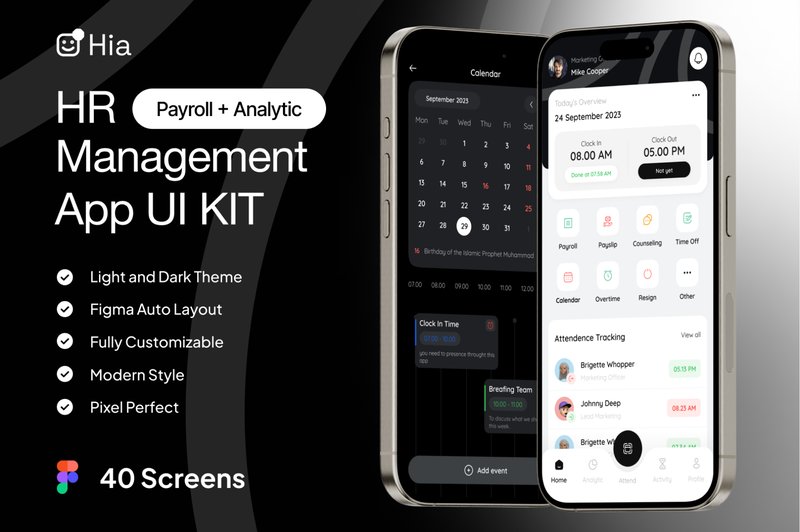
Hia – HR Management App UI KIT (by dpopstudio) strikes an immediate chord with its clean, approachable typography, lending a sense of reassuring clarity to a domain often cluttered with complex data. This kit from dpopstudio masterfully balances corporate professionalism with a refreshingly human-centric design, transforming intricate HR workflows into intuitive, visually pleasing experiences. The thoughtfully structured layouts, available in both crisp light and focused dark modes, make everything from payroll management to performance tracking feel less like a chore and more like an empowered action. Hia doesn’t just organize information; it presents it with a calm authority that builds trust and streamlines daily operations for any modern workplace.
Features:
- A comprehensive library of over 40 meticulously designed screens.
- Dual-theme support with beautifully crafted Light and Dark modes.
- Meticulously organized layers and a dedicated design system guide for rapid customization.
- Built on a flexible, scalable vector-based system in Figma.
Best for:
- Designing all-in-one HR management platforms for startups and enterprises.
- Creating specialized apps for attendance, payroll, or employee performance tracking.
- Designers needing a professional, well-documented foundation for a corporate SaaS product.
- Teams looking to rapidly prototype and validate a modern employee management tool.
31. Geex – Modern Elegant Admin Dashboard UI (by peterdraw)
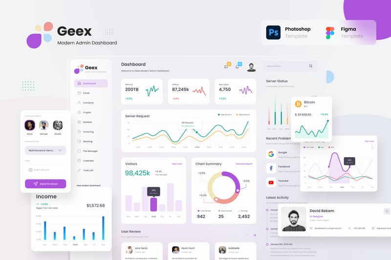
Geex – Modern Elegant Admin Dashboard UI (by peterdraw) replaces the era of cluttered, utilitarian admin panels with a breath of fresh, organized air. Drawing inspiration from the clean, translucent aesthetic of macOS Big Sur, Geex delivers an interface that feels both powerful and remarkably intuitive. Its design philosophy prioritizes clarity and comfort, using soft gradients, rounded corners, and a thoughtful color palette to make data management less of a chore and more of a streamlined experience. This isn’t just another dashboard; it’s a calm, collected command center designed to bring order to complexity, making it an essential tool for any modern digital product.
Features:
- 30+ high-quality screens covering a wide range of admin functions.
- Beautifully crafted light and dark modes for optimal user comfort.
- A clean, friendly aesthetic directly inspired by the macOS Big Sur interface.
- Fully editable and organized Figma files for seamless customization.
Best for:
- Developing sophisticated SaaS application backends.
- Creating intuitive project management tools with Kanban and calendar views.
- Building custom CRMs or internal company management platforms.
- Designing elegant dashboards for analytics, invoicing, or email clients.
32. Hoomeee – Real Estate Admin Dashboard (by peterdraw)
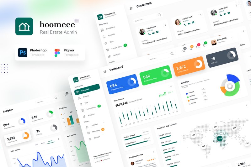
Hoomeee – Real Estate Admin Dashboard (by peterdraw) is the design equivalent of love at first sight. It bypasses awkward introductions and gets straight to the heart of what real estate professionals need: a visually stunning, intuitively organized space where data feels less like a chore and more like a conversation. With its clean typography, generous use of whitespace, and a sophisticated color palette that shines in both light and dark modes, Hoomeee transforms the often-cluttered world of property management into a calm, commanding, and utterly elegant experience. This isn’t just a dashboard; it’s a statement of professionalism and current taste, designed to make users feel empowered from the moment they log in.
Features:
- A complete set of 12 core screens, offered in both a crisp Light Mode and an immersive Dark Mode.
- Dual-format availability in both Figma and PSD for maximum workflow flexibility.
- Built entirely with free, accessible Google Fonts for seamless integration and zero licensing headaches.
- Thoughtfully organized layers and comprehensive documentation for effortless customization and handoff.
Best for:
- Designers tasked with creating a modern, data-rich interface for property management platforms.
- Developers building a custom backend for a real estate marketplace or brokerage.
- Startups looking to quickly prototype a visually polished MVP for a prop-tech application.
- Agencies creating bespoke admin systems for clients in the home rental and sales industry.
33. Gaming Shopify Ecommerce Website Design (by shahtech50)
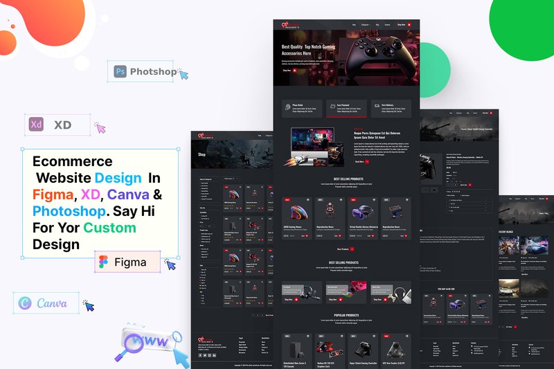
Gaming Shopify Ecommerce Website Design (by shahtech50) is the digital equivalent of modern calligraphy, where every pixel is placed with the deliberate, stylish precision of a master’s stroke. Instead of ink on paper, it uses neon glows, sharp angles, and dark, immersive backgrounds to script a powerful brand identity. This Figma template moves beyond generic storefronts, crafting an edgy, high-energy atmosphere that feels less like a simple shop and more like a gamer’s custom-built command center, perfectly tuned for both aesthetic impact and commercial performance.
Features:
- A comprehensive Figma UI kit built specifically for the Shopify platform.
- Specialized page layouts tailored for e-commerce, including detailed product pages and streamlined checkout flows.
- A distinct, modern gaming aesthetic featuring dark mode themes, bold typography, and vibrant accent colors.
- Fully customizable and well-organized components that speed up the design-to-development workflow.
Best for:
- E-commerce brands selling video games, PC hardware, and gaming peripherals.
- Official merchandise stores for esports teams, streamers, and content creators.
- Designers seeking a high-fidelity template for tech or entertainment-focused client projects.
- Startups wanting to launch a visually striking online store that resonates with a youth-oriented audience.
34. Vision – Marketing Landing Page (by dpopstudio)
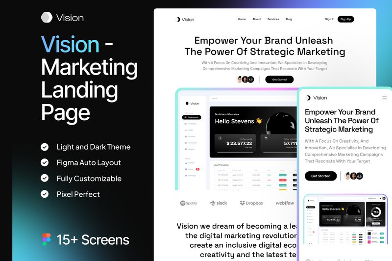
Vision – Marketing Landing Page (by dpopstudio) is the ideal launchpad for tech startups and digital agencies seeking a polished, professional online presence. This kit delivers a clean, almost clinical aesthetic that communicates trust and efficiency, using crisp typography and thoughtfully structured layouts to guide visitors effortlessly through your value proposition. The design feels both modern and approachable, balancing corporate sleekness with a user-friendly vibe, making it perfect for presenting complex software or services with clarity and confidence.
Features:
- Features over 15 meticulously designed screens, including responsive mobile versions.
- Built with 100% editable and scalable vector assets for ultimate customization flexibility.
- Impeccably organized and named layers in Figma make finding and editing components a breeze.
- Utilizes free Google Fonts for immediate and hassle-free implementation.
Best for:
- SaaS companies launching a new product or feature.
- Digital agencies creating a high-impact landing page for their services.
- Developers and studios building a promotional site for a new mobile or web app.
- Marketing teams needing a professional, conversion-focused template for campaign rollouts.
🛠️ Pro Tip: How to Customize a Kit Without Creating Chaos
A great UI kit is a starting point, not a final destination. But customizing it correctly is key to maintaining its power. Before you start detaching components and changing individual elements, follow this professional workflow to make the kit truly yours while keeping it scalable and easy to update.
- Start with Global Styles: The first thing you should do is locate the kit’s core style guide. Change the global color palette, typography styles (like H1, H2, body text), and grid settings. In modern design tools like Figma, these are often called “Styles” or “Variables.” Changing them here will update every component across your entire project automatically.
- Resist “Detaching”: It’s tempting to “detach” or “ungroup” a complex component to make a small change. Don’t do it! You’ll lose the link to the main component, creating an inconsistent one-off version. Instead, learn to edit the main component itself. This ensures your changes propagate everywhere that component is used.
- Leverage Variants: Most modern kits use variants to manage different states of a component (e.g., default, hover, disabled buttons). Instead of creating a new component from scratch, see if you can simply create a new variant of an existing one to fit your needs.
⚙️ The Anatomy of a Modern UI Kit: Understanding Components and Tokens
To get the most out of these toolkits, it helps to speak the language. Modern UI kits are built on powerful concepts that bridge the gap between design and development. Understanding them will supercharge your workflow.
- Components: Think of these as reusable building blocks. A component can be simple, like a button, or complex, like a navigation bar made of other smaller components. The magic is that if you update the main component, every instance of it in your design file updates instantly.
- Variants: These are different versions of a single component grouped together. For example, a single “Button” component might have variants for different states (Default, Hover, Pressed, Disabled) and styles (Primary, Secondary, Destructive). This keeps your files tidy and your designs consistent.
- Design Tokens: This is a more advanced concept, but crucial for 2026. Tokens are design decisions stored as data. Instead of defining a color as `#4A55FF`, you define it as a token, like `$color-brand-primary`. This token can then be used in both the design file and the code. When you update the token’s value, the change is reflected everywhere, creating a perfect sync between designers and developers.
♿ Beyond the Pixels: Your 3-Step Accessibility Checkup
A beautiful interface that isn’t usable by everyone is a failed design. While premium UI kits often follow best practices, it’s your responsibility as the designer to ensure the final product is accessible. Before you finalize your designs, run this quick checkup.
- Check Color Contrast: Use a contrast checker plugin (most design tools have them) to ensure your text and background colors meet at least the WCAG AA standard. This is especially important for text on colored buttons and links.
- Evaluate Typography: Is your body text large enough to be easily read (typically at least 16px for web)? Are your line heights sufficient (usually 1.5x the font size)? Ensure you have a clear and logical type hierarchy so users can easily scan the page.
- Assess Touch Target Size: For mobile designs, make sure all interactive elements like buttons, icons, and links have a large enough touch target. The recommended minimum is around 44×44 pixels to prevent frustrating mis-taps.
💡 Think Outside the App: Creative Uses for Your UI Kit
A UI kit’s power lies in its ability to create a consistent visual system. Don’t limit that system to just your app or website! Leverage your kit to ensure brand consistency across every touchpoint.
- Pitch Decks & Presentations: Build a template in Google Slides, Keynote, or PowerPoint using the typography, colors, and component styles from your UI kit. Your pitch for the app will look exactly like the app itself, creating a seamless and professional presentation.
- Social Media Graphics: Create a set of templates for Instagram posts, Twitter banners, and LinkedIn updates using the core components. This ensures your marketing materials feel like a natural extension of your product.
- Internal Dashboards & Tools: Need to quickly design an internal tool for your team? A UI kit is perfect for rapidly building functional, easy-to-use interfaces for dashboards, CRMs, or reporting systems without starting from scratch.
👀 Didn’t find what you were looking for?
There are hundreds more cool options in the full collection for your project.
Conclusion
With these 34 exceptional UX and UI kits at your fingertips, you’re equipped to elevate your design process. Stop reinventing the wheel and start focusing on what truly matters: creating stunning, user-centric experiences. Dive into these resources and see how they can dramatically accelerate your next project.