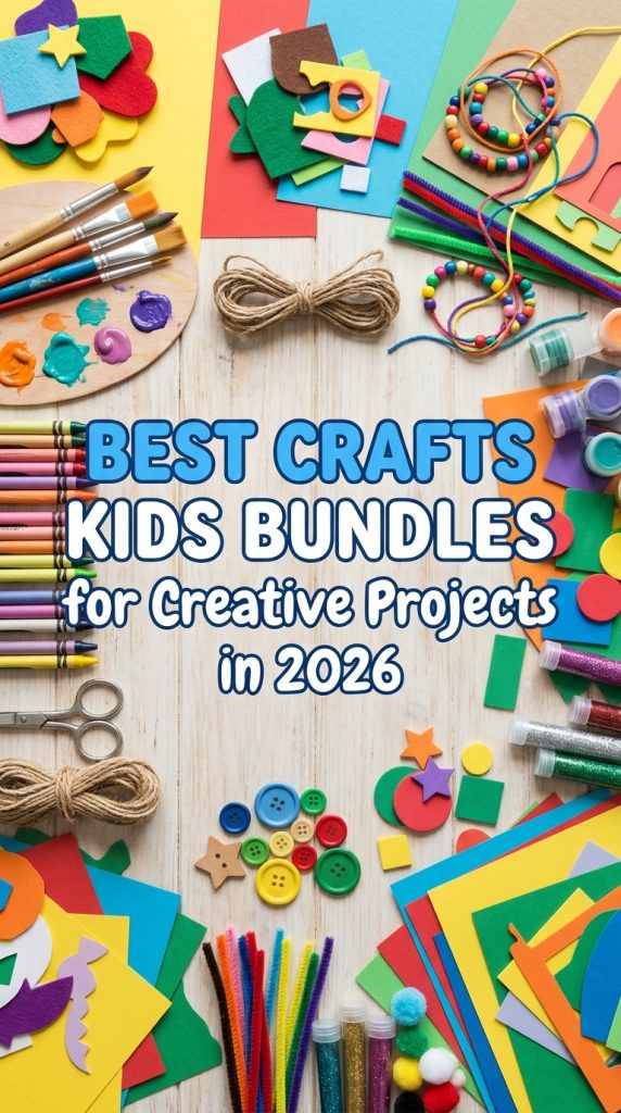
In the fast-paced world of design and DIY crafting, color is your most powerful tool. As we dive into 2026, the trends are shifting towards a fascinating blend of retro nostalgia and bold, digital optimism. Getting the color story right is crucial for creating projects that feel fresh, modern, and emotionally resonant. That’s why we’ve scoured the market to find the most popular and inspiring color palette collections available today. This curated list of five graphics packs will save you time and provide the perfect chromatic foundation for everything from branding projects to handmade creations.
Top Collection Picks (2026 Edition)
1. Retro Christmas Tint Color Palette (by nurearth)
Retro Christmas Tint Color Palette (by nurearth) immediately wraps your designs in the warm, gentle glow of a cherished memory. This collection moves beyond the typical bright reds and greens, offering a sophisticated, sun-faded take on holiday cheer that feels both nostalgic and refreshingly modern. Each hue evokes the feeling of unwrapping vintage glass ornaments or flipping through a treasured family photo album from decades past, making it an instant go-to for projects that require a touch of timeless, sentimental style.
Features:
- A professionally curated collection of vintage-inspired holiday tints.
- Transitional tones that blend seamlessly into fashion, home décor, and branding projects.
- Includes versatile, high-resolution file formats (EPS, SVG, PNG, JPG) for easy integration.
- Fully editable vector files allow for complete customization and creative control.
Best for:
- Designing sophisticated holiday cards, packaging, and seasonal marketing campaigns.
- Creating cohesive branding suites, website themes, and social media graphics with a retro vibe.
- Developing unique color stories for textile prints, apparel, and interior design mockups.
- Crafting digital illustrations and patterns in Procreate that require a gentle, nostalgic touch.
2. Terracotta Color Palette Collection (by nantia)
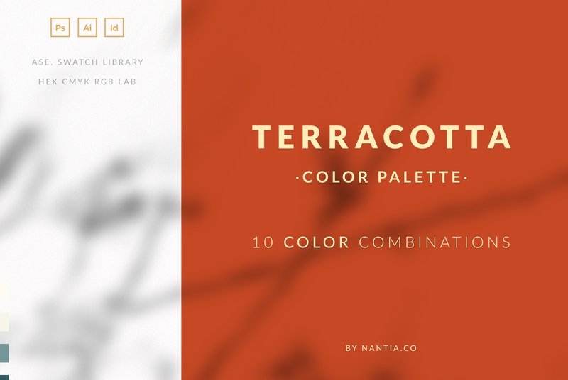
Terracotta Color Palette Collection (by nantia) is a meticulously curated journey into the sun-drenched warmth and earthy elegance of terracotta. This collection moves beyond a single shade, offering ten sophisticated and harmonious color sets that pair the foundational clay tones with muted greens, soft creams, and deep, dusty blues, creating a palette that feels both grounded and incredibly current. It’s the perfect toolkit for designers looking to infuse their work with an organic, inviting, and effortlessly chic aesthetic.
Features:
- Ten expertly paired color combinations built around a central terracotta theme.
- A comprehensive PDF guide with 50 unique color values listed in RGB, CMYK, and HEX formats.
- Ready-to-use .ASE swatch file for seamless integration with Adobe Illustrator, Photoshop, and InDesign.
Best for:
- Creating sophisticated branding for lifestyle, wellness, or artisanal product lines.
- Designing cohesive and warm social media templates for platforms like Instagram and Pinterest.
- Developing elegant wedding stationery, event invitations, and digital lookbooks.
- Crafting digital illustrations and surface patterns with a modern, bohemian vibe.
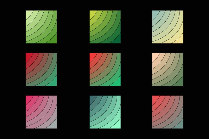
3. Frozen Christmas Color Palette (by nantia)
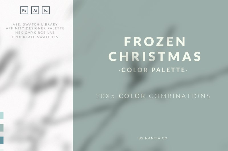
Frozen Christmas Color Palette (by nantia) is the antidote to the tired, oversaturated reds and greens of traditional holiday design. Say goodbye to jarring primary colors and embrace a world of sophisticated, wintery magic. This collection delivers a breath of fresh, frosted air with its ethereal blend of icy blues, muted silver-pinks, deep teals, and frosted plums. Each of the 100 colors is thoughtfully curated into 20 harmonious sets, creating a cohesive and elegant system perfect for projects that demand a chic, contemporary, and atmospheric holiday vibe. It’s less about jolly spectacle and more about the quiet, crystalline beauty of a winter morning.
Features:
- 100 masterfully curated colors organized into 20 unique sets of five, providing endless harmonic combinations.
- Comprehensive file support for Adobe Creative Suite (.ASE for Ai, Ps, Id), Affinity Designer, and Procreate.
- Includes a detailed PDF reference guide with RGB, CMYK, and HEX color values for seamless cross-platform consistency.
Best for:
- Designing sophisticated holiday branding for luxury goods, boutique retailers, and lifestyle brands.
- Creating elegant winter wedding invitations, high-end stationery, and event collateral.
- Crafting atmospheric social media campaigns, digital lookbooks, and website banners with a modern, cool-toned aesthetic.
- Developing chic packaging and product labels for seasonal beauty, home goods, or confectionery collections.
4. Turquoise Color Palette Collection (by nantia)
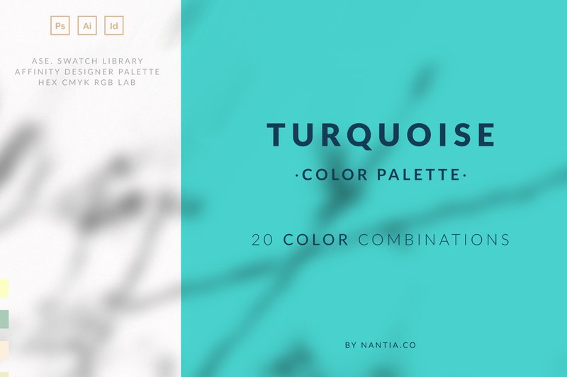
Turquoise Color Palette Collection (by nantia) If you are looking for a palette that balances serene sophistication with a fresh, modern energy, this collection is your new secret weapon. This isn’t just a single shade; it’s a comprehensive exploration of turquoise, masterfully paired with complementary hues ranging from warm, sandy neutrals to deep, oceanic blues and vibrant coral accents. Each combination feels intentional and professionally curated, providing a versatile foundation for projects that need to feel both calming and contemporary, evoking clear waters, open skies, and refined digital aesthetics.
Features:
- Includes 20 professionally curated 5-color palettes, offering a vast range of harmonious combinations.
- Seamlessly integrates with your workflow via .ASE swatches for Adobe Creative Suite (Illustrator, Photoshop, InDesign) and a dedicated Affinity Designer palette file.
- Comes with a detailed PDF guide containing RGB, CMYK, and HEX color values for perfect consistency across digital and print projects.
Best for:
- Branding and identity design for wellness, travel, tech, or coastal-inspired businesses.
- Creating cohesive and visually stunning social media graphics, web interfaces, and digital marketing campaigns.
- Editorial layouts, lookbooks, and high-end print collateral that require a touch of modern elegance.
5. Christmas Color Palette (by nantia)
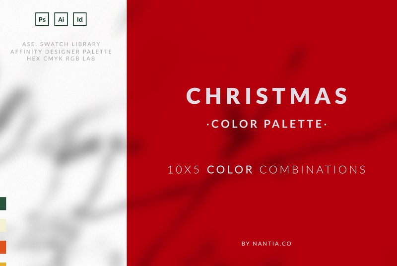
Christmas Color Palette (by nantia) delivers a sophisticated and modern take on classic holiday aesthetics, providing a rich vocabulary of color that moves beyond the expected red and green. This collection is curated for designers seeking to evoke a warm, contemporary, or even elegantly muted festive mood. With thoughtfully paired combinations, it allows for the creation of visuals that feel both nostalgic and perfectly on-trend, making every project feel custom and inspired.
Features:
- An expansive library of 50 distinct colors, organized into inspiring combinations.
- Broad software compatibility with included .ASE swatches for Adobe Illustrator, Photoshop, and InDesign.
- A dedicated color palette file for seamless use in Affinity Designer.
- A comprehensive PDF reference guide listing RGB, CMYK, and HEX values for each color.
Best for:
- Designing cohesive seasonal branding for marketing campaigns and e-commerce.
- Creating stylish holiday social media graphics, story templates, and web banners.
- Developing unique product packaging, greeting cards, and festive illustrations.
- Crafting elegant digital lookbooks, menus, and event invitations.
Pro Tip: Applying Palettes with the 60-30-10 Rule
A great color palette is just the starting point. To create a balanced and professional-looking design, use the classic 60-30-10 rule. This interior design principle works perfectly for graphics, branding, and web design. It ensures your colors are distributed harmoniously and don’t overwhelm the viewer.
- 60% Primary Color: This should be your most dominant color, often used for backgrounds or the largest visual areas. It sets the overall mood.
- 30% Secondary Color: This color supports the primary one and is used for key elements like headlines, sub-sections, or important graphics. It creates contrast and visual interest.
- 10% Accent Color: This is your boldest or most vibrant shade, reserved for small but important details like call-to-action buttons, icons, or highlights. It’s meant to draw the eye.
Technical Brief: Understanding Color Codes (RGB vs. CMYK)
When you download a color palette collection, you’ll often get codes for different color models. Knowing which one to use is crucial for getting the results you expect, especially when moving from screen to print.
- Use RGB (Red, Green, Blue) for digital projects. This model is designed for screens, like websites, social media graphics, and digital ads. The colors are created by mixing light and will appear bright and vibrant on a monitor. Most graphic packs will provide HEX codes (e.g., #FFFFFF), which are based on RGB.
- Use CMYK (Cyan, Magenta, Yellow, Black) for print projects. This model is for anything that will be physically printed, such as business cards, packaging, or posters. The colors are created by mixing ink. Important: Bright RGB colors often look duller when converted to CMYK, so always do a test print if color accuracy is critical!
Usage Scenarios: Themed Content & Product Mockups
Think beyond single designs and use a full color palette to create a cohesive and immersive brand experience. These collections are perfect for building a consistent visual story across multiple assets.
Try using a single palette to design a complete set for a product launch or marketing campaign. For example:
- E-commerce Store: Use the palette for your website banners, product photo backgrounds, Instagram story templates, and even the thank-you card you include in the packaging.
- DIY Crafter: Create a series of related art prints or sticker sheets using different combinations of the same 5-6 colors. This makes your work instantly recognizable and encourages customers to buy multiple items.
- Event Planning: Apply a single palette to everything from the digital invitation and social media announcements to the physical signage, name tags, and decor at the event itself.
Style Context: Pairing Fonts with Your 2026 Palette
The right font pairing will amplify the mood of your color palette. As the 2026 trends blend retro and futuristic themes, your typography should do the same. Here are some quick guidelines:
- For palettes with retro or nostalgic vibes (e.g., muted oranges, avocado greens), pair them with a bold, rounded serif font for headlines and a clean, simple sans-serif for body text. This creates a warm, vintage-modern feel.
- For palettes with bold, digital optimism (e.g., electric blues, vibrant magentas), lean into futuristic typography. Use a sharp, geometric sans-serif for headers and a lightweight, minimalist font for paragraphs to create a sleek, high-tech look.
👀 Didn’t find what you were looking for?
There are hundreds more cool options in the full collection for your project.
Conclusion
With these five exceptional color palette collections at your fingertips, you’re equipped to tackle any creative challenge 2026 throws your way. Don’t be afraid to experiment and mix these hues to develop a signature style that captivates your audience. Happy creating, and may your projects be vibrant!